Behind the Scenes of Yuri!!! On Ice’s Costume Design 6
Here’s the weekly installment of Yuri!!! On Ice’s design work insight thanks to Chacott and Good Haro.
We’re in the middle of the Grand Prix and the story’s really starting to heat up in episode 7! Continuing from last time, we’ll be talking about the free program costumes from the Cup of China.
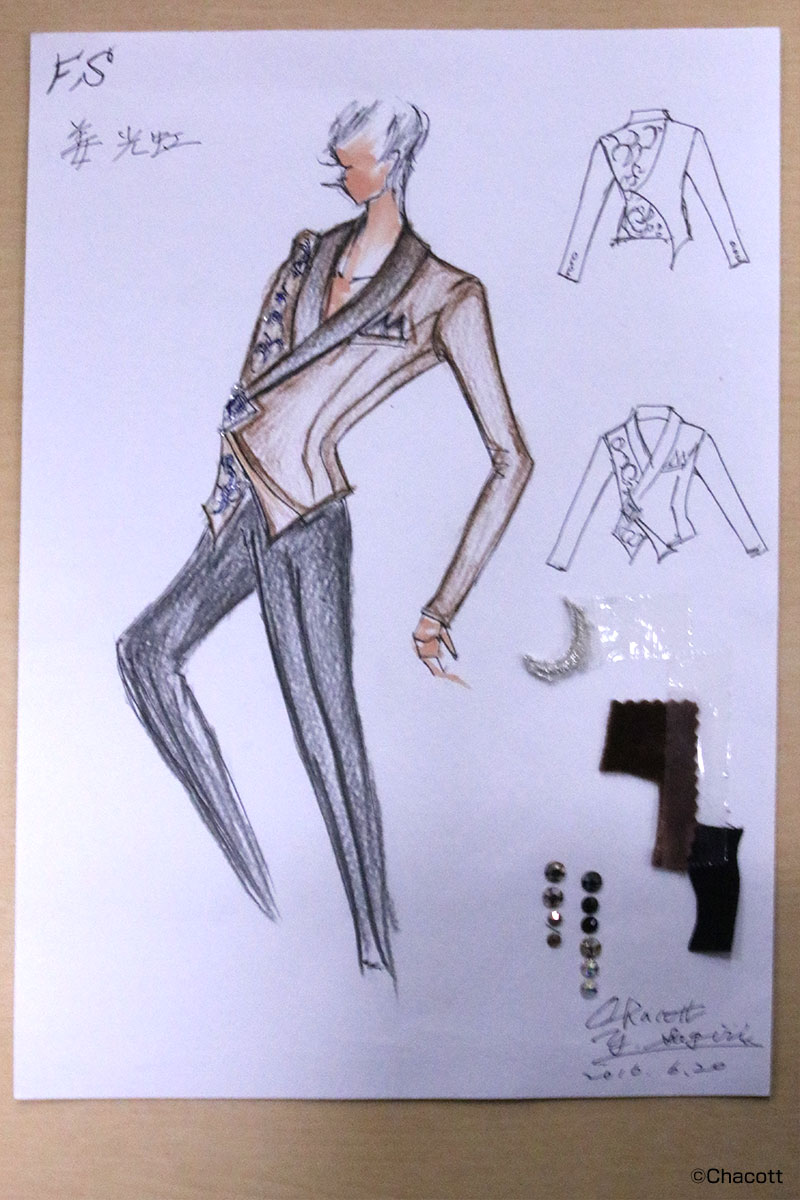
Let’s start with Guang-Hong Ji, the representing the competition’s host country, China. He’s wearing a jacket style outfit that’s very open at the chest. How did you approach designing this one?
Ms. Yamamoto told me the theme for his free program was “bonds and violence” so I went for something mafia-esque. He might be only 17, but I figured he’s the type to want people to view him as more of an adult, so I went with a [mature] brown color scheme to deliberately contrast his youth. I gave the jacket a shawl collar and kept the chest quite open for similar reasons. The uneven hem as well. Half of the jacket has a silver appliqué along with brown and black rhinestones.
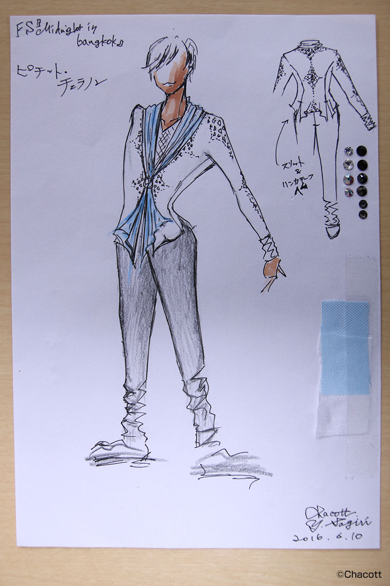
Next, Phichit Chulanont. He used “The King and the Skater” as the theme for both his short and free programs, but his free program costume is a pretty drastic departure in color from what he wore in the short program.
It certainly is. It may be the same theme, but apparently [in the sequel film] they time warp to the future (modern day).
So, I was trying to make his free program outfit look a little more like normal clothing. I made the body of the jacket white to complement Phichit’s darker skin too.
While his short program had a solemn, dignified air about it, his free program has a more light, refreshing feel to it.
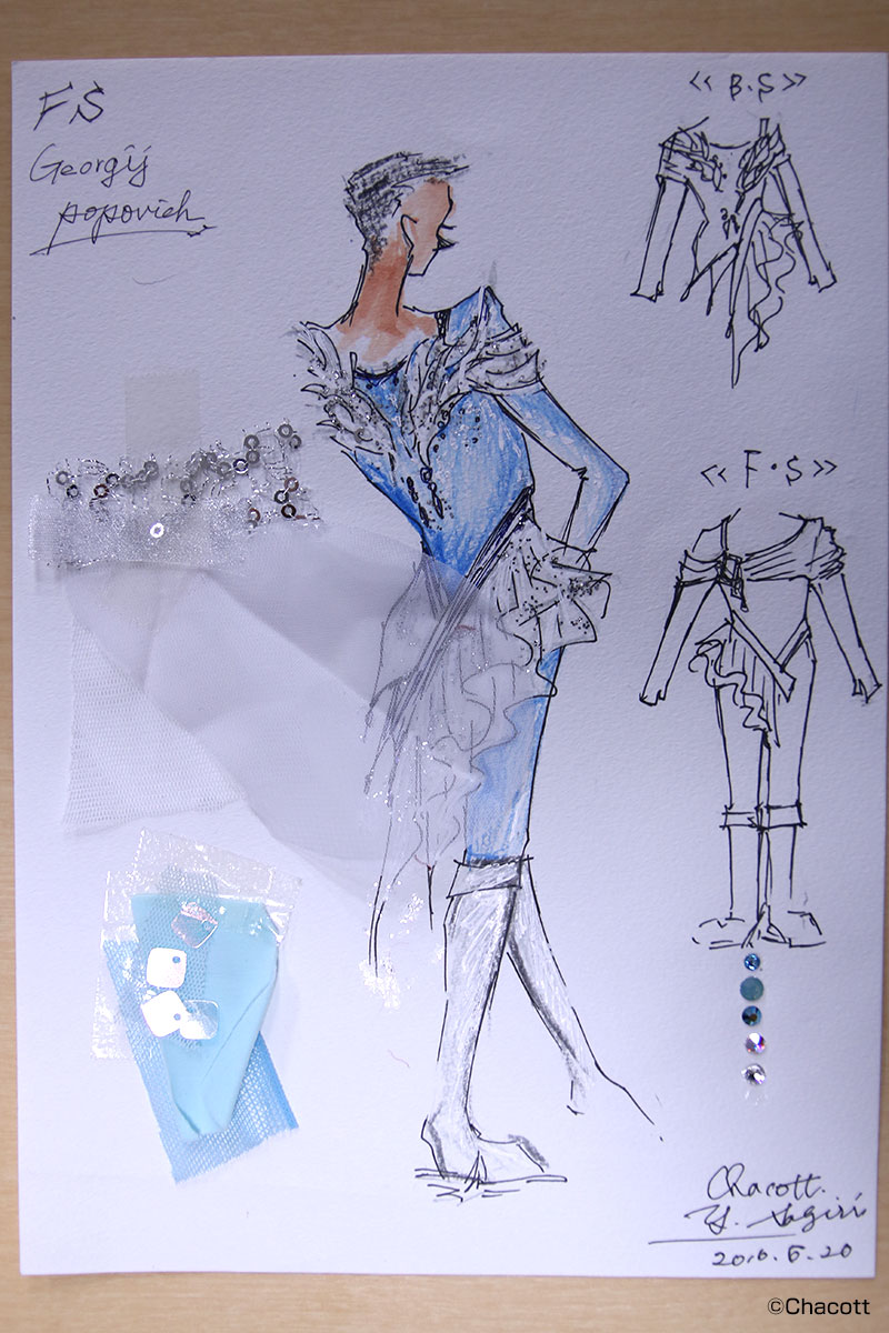
Georgi Popovich’s short program really highlighted his unique charms, but could you tell us a little about his free program outfit?
Actually, Ms. Yamamoto told me that his costume “trademark” is spaghetti straps, but since Carabosse was the inspiration for his short program’s costume, I couldn’t use them there. So in his free program outfit I made sure to include a spaghetti strap. He must be very confident in his décolletage!
The other element of the design was the idea that it should encompass both the male and female roles––the prince and the princess.
Could you be more specific about that?
The draping around the neckline, the belt, and the boots are meant to evoke the image of the prince (or knight), while the frilly elements on the belt are meant to give the impression of the princess’ skirt.
Why did you decide to use blue?
Pink seems like the obvious choice in terms of “princess” colors, but it seemed a little too feminine, so I went with an icy blue instead. The color ended up a bit softer in the anime.
What material are the boots made out of?
Pleather. It’s a knit fabric with a material that looks like leather attached to it.
It’s available in many more colors than real leather, it’s lighter and harder to stain, so it’s a great material to work with. The types with polyurethane in them are even nice and stretchy.
It may not be a terribly common material in figure skating, but it’s used quite a lot in theater costumes.
It looks like he has wings on his back.
That was actually another request of Ms. Yamamoto’s. They’re meant to be made of organza or tulle cutouts, adorned with crystal and blue rhinestones.
Organza has both a nice sheen and more body to it, so I used it for the feathers to give them a more solid feeling.
I opted for a georgette for the frill though. Georgette has a much finer weave, making it more matte and supple.
I added a dove appliqué to the front as an accent. White doves are symbolic of happiness and love, and that’s absolutely representative of the theme he’s going for. It sounds like he even got the nickname “dove” from his last name, Popovich (lol).
*-I’m sorry, this joke is totally butchered in English. “Popo” is the sound pigeons/doves make in Japanese.
Lastly, could you tell us about Christophe Giacometti’s costume?
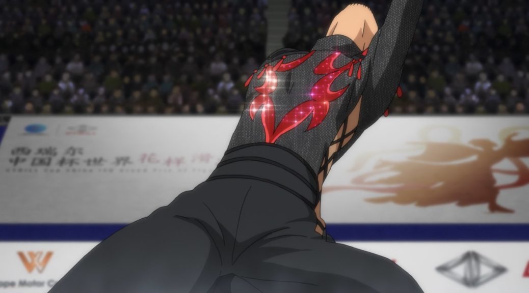
His free program uses a Bolero theme, so I wanted to use black and red to bring out a Spanish influence. Just like his short program costume, I went with a bodysuit style to highlight his figure.
Now that you mention it, the shoulders of the costume are pretty reminiscent of a matador’s costume!
Yep. He has a strong frame, so I wanted to highlight it with those matador-ish shoulders.
The sides look see-through even in the anime…
Yes, I figured he’d be the type to want to show some skin, so I designed the costume with big openings from under his arms, down to his hips. But it’s not actual skin since there would be skin-tone fabric underneath the lacing (lol).
I see the top is mesh in the design.
I picked a see-through fabric to emphasize the movement of his muscles. It’d seem like you could see even more skin than how it ended up in the anime. The appliqué on top of it would have been made up of lace and sequins. The sides of the pants were meant to be just a sequin appliqué, but it turned into tassels in the anime.

And that’s it for this installment. In the next episode, we’ll see even more costumes in the Rostelecom Cup! Look forward to it!
Support us on Patreon so that we can keep producing all this content and fullfill our next goals, as well as affording all server expenses. Thanks!