Animation Awards 2019 Day Two: Best Aesthetics
Our animation awards continue with the aesthetics that have impacted fans and industry members the most: the most inspired art direction and color design, the animation designs that fulfill their goals the best, and most striking compositing to bring it all together!
Entries:
— Shouta Umehara
— Geth
— SFLSNZYN
— MLANG
— Felix
— FakeArasan
— ちな
— Futon
— Natasha
— Kevin
Shouta Umehara
[Twitter]

- Best Animation Designs: The Promised Neverland (Kazuaki Shimada)
My choice in this regard has to be Kazuaki Shimada’s work in The Promised Neverland. The way he adapted such tricky designs into animation is so skillful! Despite having such a massive cast, the results were excellent across the board. It’s truly an honor to be able to count him among my seniors.
- Best Art Direction: Fire Force (Yoshito Takamine, Toshiki Amada)
Fire Force is the kind of work that made me immediately go look up and see what studio was responsible for the scenery – that’s how much its art direction spoke to me.
- Best Color Design: The Promised Neverland (Kazuko Nakashima)
This one was an easy choice: Kazuko Nakashima‘s palette for The Promised Neverland commands such presence, and it’s simply a beautiful sight to behold.
Geth
[Twitter]
![]()
- Best Animation Designs: BLACKFOX (Atsushi Saito)
A worthy litmus test for effective character design is seeing the degree to which they can bend without breaking under the hand of such distinctive artists as Hironori Tanaka, and in the case of Atsushi Saito’s design debut on BLACKFOX, the result is quite striking! It should hardly come as a surprise considering the best character-acting focused animators usually possess a similar strong eye for design. While I wouldn’t say Saito’s BLACKFOX designs are particularly revolutionary, they instead manage to accumulate a lot of smaller details into one extremely effective – and also adorable – final package.
One of those smaller details worth mentioning is the noses: the center point of the face and thus, responsible for dictating the spacing and arrangement of every other element. It’s the factor that most commonly makes or breaks designs and in this case the minimal, low-profile shading drives all the lovely character acting found throughout the film. I’ll be anxiously awaiting a sequel to this series at some point, hopefully with a similar staff returning, as letting such strong foundational work across the entire production be limited exclusively to a short movie would be a greater crime than it never existing in the first place!
- Best Art Direction and Color Design: PROMARE (Tomotaka Kubo, Yukiko Kakita)
It seems right to group these two aspects into the same category, as for any production to truly succeed in its aesthetic it’s imperative for the background elements to reside in harmony with the color palates placed before them, and I can think of no better example of than one of the visually busiest movies of the year, PROMARE.
Formed only recently in 2015, Deho Gallery is a background studio known for their more traditional hand-painted work on various Ponoc films and MAPPA series, making them an interesting choice for PROMARE – a movie acting in anything but traditional ways. Hiroyuki Imaishi’s vision would instead require a digital pipeline (which Deho already had despite their focus being elsewhere), filled with sharp angles, little in the way of outlines, and of course the most important part, lots of delicious pastel colors! If adapting to a new approach was in any way a challenge for art directorArt Director (美術監督, bijutsu kantoku): The person in charge of the background art for the series. They draw many artboards that once approved by the series director serve as reference for the backgrounds throughout the series. Coordination within the art department is a must – setting and color designers must work together to craft a coherent world. Tomotaka Kubo, it is in no-way evident from the final product. PROMARE’s art direction serves as such a strong foundation for the movie that I feel that, were it not for it, even the charming humor that captured the audience in theatres all over the world would not be the same.
- Best Compositing: Boruto (Mai Masuo)
While Boruto’s in-house photographyPhotography (撮影, Satsuei): The marriage of elements produced by different departments into a finished picture, involving filtering to make it more harmonious. A name inherited from the past, when cameras were actually used during this process. team lead by Mai Masuo at Pierrot D.A.R. has been strong from the very first episode of the series, it’s only with this past year that they’ve been afforded a little extra time to polish their output and deliver a more consistent twenty minutes worth of greatness per week. An unintentional consequence of having a relatively unambitious stretch of episodes is that they find their way to completion slightly faster, in turn strengthening the production schedule and giving more time for the photographyPhotography (撮影, Satsuei): The marriage of elements produced by different departments into a finished picture, involving filtering to make it more harmonious. A name inherited from the past, when cameras were actually used during this process. crew to harmonize all the different on-screen elements.
Boruto’s particular strength has always been in the outline filtering; rarely looking out of place, especially when compared to its parent and predecessor series. However, more recently we’ve seen episode director Takeru Ogiwara start experimenting with digital tools as well, turning a fairly unimpressively 2D-animated scene into something almost ufotable-lite by way of the attractive post-processing techniques. Here’s to hoping Ogiwara makes a swift return for the upcoming arc, as his involvement is always a highlight. In the meantime, the rest of the staff will be here to pick up the slack!
SFLSNZYN
[Twitter]
![]()
- Best Art Direction: Ride Your Wave (Fuminao Akai)
Masaaki Yuasa is known for employing dynamic animation in his works. With his new film Ride Your Wave, however, he purposely instructed the team to aim for more detailed background art, rooting the movie more strongly in reality. This approach matches an overall aesthetic trend in Japanese animation towards packing a larger amount of visual information on-screen, as seen in modern hits like Your Name. And in this case, the result was simply delightful; Ride Your Wave is a poignant love story that’s likely to resonate young audiences with its fashionable visuals, in no small part because of that rich depiction of the setting.
- Best Compositing: Weathering with You (Ryuusuke Tsuda)
Makoto Shinkai’s new film Weathering with You revolves around weather and how natural phenomena can intersect with people’s feelings. Although it’s not easy to portray weather in animation, his background and photographyPhotography (撮影, Satsuei): The marriage of elements produced by different departments into a finished picture, involving filtering to make it more harmonious. A name inherited from the past, when cameras were actually used during this process. crews can boast of their specific expertise in this regard, which boosts the feeling of authenticity in his works. If you look at his recent films in particular, it becomes obvious that Shinkai tries to showcase the urban scenery of Tokyo as true to life as possible so that his audience can easily relate to those experiences. And that requires not just meticulous designs, but also a highly coordinated effort from various departments that is compiled during the compositing process.
According to photographyPhotography (撮影, Satsuei): The marriage of elements produced by different departments into a finished picture, involving filtering to make it more harmonious. A name inherited from the past, when cameras were actually used during this process. director Ryuusuke Tsuda, this time around the theme for the compositing team was “making art move” with a focus on color. It’s also worth noting that Shinkai has been a pioneer in employing new tools and digital procedures, like using the recently developed Google Earth Studio to generate 3D layout references in this film. When it comes to these matters, there’s no denying that his works set a high standard for modern animation films.
MLANG
[Twitter]
- Best Animation Designs: Ride Your Wave (Takashi Kojima), BLACKFOX (Atsushi Saito)
With Ride Your Wave, Takashi Kojima illustrates a Masaaki Yuasa-flavoured take on the hot young couple romance genre and man is everyone in this movie beautiful. Delightfully loose outlines breathe spontaneity into every drawing and the forgiving inherent wobble of it all really invites animators to bend and warp human figures however they please. Designs that joyfully blur the lines between character and FXFX: Shorthand for effects animation – water, fire, beams, that kind of cut. A pillar of Japanese 2D animation. – what a perfect philosophy for the film’s watery premise!
Meanwhile, Atsushi Saito’s charming BLACKFOX designs generated a lot of enthusiasm from the animation crowd on my timeline – and it’s not hard to see why, they’re simply adorable..! Cuteness levels (not to be taken lightly) aside, while attempting to draw them I found myself increasingly impressed by how subtly optimized everything was for producing great movement and a fun workflow; charmingly minimalist shadows slice boldly across large areas of detail instead of concerning themselves with bumping in and out of every crevice, efficient to apply and incredibly stylish.
I could point at many precise details that highlight the thought that went into them; such as Lily’s combat suit, cleverly outfitted with markers at all essential areas of rotation: hips, knees, forearms and torso, making it a breeze to indicate precise angle changes even in faraway shots. Stuck creating visual continuity for your low key count, fast-paced action scenes? No worries, the protagonist has a fabulous scarf and bright red hair streaks you can use to direct the chaos in 3 easy strokes. As great as they look, these really were designs made with function in mind and seriously amazing ones at that!
- Best Art Direction: Children of the Sea (Shinji Kimura)
For a film with such strongly idiosyncratic artwork, I was surprised at how easily I felt myself being submerged into Children of the Sea’s world. I did still think about the craft of it at times, but there were almost no notable moments of jarring disconnect; quite the feat in a film bouncing back and forth between presenting naturalistic real-world settings and abstract textures with pure white scratchboard carvings on black.
The magic of the art direction was somehow giving cohesion to those distinct elements. Making it feel like it belonged in the same film, and even building up to unique visual ‘climax’ moments thanks to its excellent colour script. A muted palette of grayish sandy midtones will make ocean blues seem to sparkle ever brighter. A fireworks show appears more magical at midnight, and by the same principle, Children of the Sea conditions your retinas to expect the narrower hue and value range of Ruka’s overcast seaside town before ramping up the contrast and unleashing a show of primal full-spectrum colours and white on pure black in its final arc.
I came into my screening fully expecting to feel exhausted by the tremendous information density, but instead the film felt like a masterclass in managing visual contrast. High density textures are constantly surrounded by large masses of negative space, while character shading is kept minimal allowing meticulous linework to take the spotlight. And at the core of it all lies Shinji Kimura’s masterful background work; paintings that appear true to life at first glance, but upon closer inspection reveal to eschew realistic lighting in favor of building up depth with organic texturing and multiplane layers.
Lighting doesn’t always wrap around an object’s logical 3D form, but is instead applied in gentle gradients to entire planes, lending a subtle feeling of illustrative ‘flatness’ to even the most densely detailed shipyards and lived-in street corners. That omnipresent flatness, in turn, making the transitions to zero-background artwork feel surprisingly natural. That’s the impossible balance at the core of this impossible production.
- Best Color Design: Carole & Tuesday OP1&2 (Jun Kumaori)
For the same reasons mentioned in the OP/ED section yesterday: those image boards just can’t be beaten!
Honorable mentions: Raison D’etre (Eve MV), Natsu no Niwa MV – directed by Yojiro Arai (Filmony) for Kagome Juice.
- Best Compositing: Children of the Sea
Tekkonkinkreet showed us what the possibilities of a symbiotic relationship between digital technology and appealing hand-drawn textures, and Children of the Sea really felt to me like the ultimate maturation of that philosophy and workflow.
The compositing was impressive to me for its seamlessness, but also the sheer emotion it conveyed. Raw traditional mark-making faithfully adapted from Daisuke Igarashi’s source material is regularly blended with immense schools of glimmering computer-generated fish to lend an incredible feeling of density and scale to important underwater scenes without the components ever feeling jarring. Meanwhile, digital DoF is generously applied during significant moments like facial closeups, shadow borders and cel edges dropping away under a heavy blur to give almost surreal focus to sharp eyelashes or sea-wrinkled fingertips.
The composite at times almost guides the viewer to focus into a surreal macro space, as if finding yourself in Ruka’s shoes unwillingly staring into the very blue eyes of a beautiful stranger, a bit uncomfortable but unable to look away.
I can’t speak for anyone else, but I sure underestimated the amount of CGI involvement in this scratchy pencil-stroke covered film, and definitely would not have given the department enough credit if not for some fantastic CGWorld articles discussing many production happenings in-depth; that even includes coverage of the team’s inventive workflow to unify the linework of their mixed team of digital and paper animators, involving backwards-editing digitally drawn genga to look like it was drawn on paper and then superimposing two versions of the same drawing on top of each other.
Honorable Mentions: Hoshiai no Sora (in particular episodes #03 and #05), Raison D’etre (Eve MV)
Felix
[Twitter]

- Best Animation Designs: Mob Psycho 100 II (Yoshimichi Kameda)
By virtue of having Yoshimichi Kameda as your character designer, you’re essentially guaranteed a stellar visual style. Even keeping in that in mind, though, Mob Psycho 100’s second season stood out to me by looking even better than the original series, and a lot of that has to do with the mileage they got out of the incredibly flexible designs. Mob can go from adorable to menacing in a heartbeat depending on the number of lines on his face, and with the designs being as simple as they are, they don’t take away from any effects-heavy sequences by pulling focus towards the characters. I’m always impressed by the range of expression the staff can pull off with these characters – it adds to what makes the show such an engrossing experience.
- Best Art Direction: Fire Force (Yoshito Takamine, Toshiki Amada)
The appeal of Fire Force’s art begins with the setting itself: by virtue of the fact that most of the world was destroyed during the catastrophe, they get to do neat things with what’s left. With that, you end up with cathedrals being haphazardly retrofitted with more modern technology. Exposed piping becomes a visual motif that unifies the look of a lot of the older structures and urban areas in this world. The thoroughness of the concept becomes obvious as you notice that the places with more funding to work with had more elegant and discreet reconstructions, in more metropolitan settings in the first place. For example, section 1’s headquarters notably has less exposed piping and more of the cathedral’s aesthetic was preserved.
The places where that steampunk-ish motif is entirely absent are just as deliberate: they’re regions disconnected from the current social order, meaning sparser and less lived-in settings like the underground area where Shinra fights Sho later in the season. Not by coincidence, places like that share the aesthetics of the churches that the fire force use as bases, but without the warm comfort of the sun and by extension the god that our heroes pray to – something that easily establishes the identity of the villains as an obvious dark mirror. And of course, the execution of those ideas is as strong as the concepts themselves; a lot of the work here is done by the absence of light, and when it does shine through, its tone is colder with a lot of blues. Coupled with storyboards that also frame these environments in interesting ways, it comes together as a very cohesive vision for the setting, one that I’ve enjoyed gawking at every episode.
FakeArasan
[Twitter]
- Best Compositing: Weathering with You (Ryuusuke Tsuda), Demon Slayer: Kimetsu no Yaiba (Yuichi Terao)
Weathering with You‘s compositing work has all the trappings of Makoto Shinkai‘s signature style, so if you’ve seen Your Name, you should know what to expect. Which is to say, it’s a gorgeous-looking movie.
In the TV anime space, I have to hand it to Yuichi Terao‘s work on Demon Slayer: Kimetsu no Yaiba. There were some initial concerns that Terao’s heavy-handed digital processing would clash with the character designs which feature bold lines, but surprise, surprise, the final result looked very good indeed. The digital gradients one would expect from Terao’s handiwork took a step back in favour of showing bold lines in character closeups, yet retaining the atmospheric lighting many are fond of. Integration of various elements is key to good compositing, and this scene in episode 12 is a great demonstration of making a 2D character move in sync with a 3D background.
Honorable mentions: Fate/Grand Order 4th Anniversary PV, Fastening Days 2, Shishigari.
ちな
[Twitter]

- Best Art Direction: Children of the Sea (Shinji Kimura)
Without a doubt, the world that fascinated me the most was Children of the Sea’s. The art design helped give everything a wonderfully lived-in feel; details like all of the trinkets and doodads that fill the interior spaces and beaches go a long way.
- Best Color Design: Cencoroll Connect (Atsuya Uki, Kanako Hokari)
Cencoroll Connect was a beautiful movie that demonstrated Atsuya Uki’s keen eye for color, while managing to achieve a unified feeling of density between the character art and the backgrounds. Promare was a strong contender as well, but in the end I picked Cencoroll over it due to personal preference in terms of the palette.
To be honest, I hope that more commercial anime like this can come out of Japan in the future; works that aren’t held down by preconceptions from the existing traditional animation canon, as original as Cencoroll.
- Best Compositing: Children of the Sea
Once again I have to go with Children of the Sea. From the ways it depicts light to the way it brings out textures, it feels like the leading edge of Japan’s 2D animation: a harmonious marriage of the techniques from the analog era with digital processes.
Futon
[Twitter]

- Best Animation Designs: Sarazanmai (Kayoko Ishikawa)
I’ve been following Kayoko Ishikawa since her amazing work in Aikatsu!, but to be frank, her style back then didn’t feel like something that would translate well into regular character design work. And yet there she was, acting as Sarazanmai’s animation designer, providing something quite different from the style she excelled at – and somehow even better than before!
I still can’t get over the fully volumetric feeling of the character art in Sarazanmai. Kunihiko Ikuhara’s anime is often storyboarded in a rather flat way – likely due to his Osamu Dezaki inspiration – which gives those titles the theater stage feel he wants. The downside, though, is that that can make them look… well, flat. And it’s precisely in that regard where having characters that feel like they’ll pop out from the screen can make the difference, which is exactly what happened here. Oh, and the fact that Ishikawa draws fantastic boys helps too, of course.
- Best Art Direction: Fire Force (Yoshito Takamine, Toshiki Amada)
Another weakness of mine is studio Bihou’s background artwork – especially when we’re dealing with an inventive setting that tests the imagination of the art directorArt Director (美術監督, bijutsu kantoku): The person in charge of the background art for the series. They draw many artboards that once approved by the series director serve as reference for the backgrounds throughout the series. Coordination within the art department is a must – setting and color designers must work together to craft a coherent world. and designers, as opposed to the generic cities and forests that they’re sometimes entrusted with. And it goes without saying, but Fire Force fits the bill perfectly in that regard. Not just that, it also provides something I value greatly: a color theme to its world, like Fire Force’s browns and dark red complimenting the fire element of the whole show. Although I don’t hold it as the studio’s best work to date, it was more than good enough to make me fall for it.
- Best Compositing: Sword Art Online: Alicization (Kentarou Waki)
Although I’m aware that his style is rather divisive, I have to say that I simply love Kentarou Waki‘s work as photographyPhotography (撮影, Satsuei): The marriage of elements produced by different departments into a finished picture, involving filtering to make it more harmonious. A name inherited from the past, when cameras were actually used during this process. director on titles like Sword Art Online: Alicization. You can’t find other shows with that mellow “shading,” which almost makes it seem like everything was colored by hand with color pencils. After he essentially changed the texture of the whole franchise with Sword Art Online’s movie I was afraid he’d leave, but fortunately he did stay for the third season. So much about the show’s current look is owed to him!
Natasha
[Twitter]

- Best Art Direction: Tsurune (Shouko Ochiai)
It feels strange to remember that the delicate, beautiful Tsurune finished airing this year before the fire incident stole so much away from us, the world and Kyoto Animation. But to end 2019 on such a heavy note would not be deserving of the heartfelt series they’ve made or the connections we’ve formed with their original and adapted works. Instead of grief, I remember fondly how Tsurune was perhaps the first KyoAni show to remind us that recovery is always an option, and that we can start over, even when trauma seems to steal so much from us.
Art is a two-way connection, and nothing signifies this more than Tsurune, with its delicate and calm art direction. The first episode in particular, and Shouko Ochiai’s debut, still lies fresh with me even almost a year later. Tsurune’s attention to the calm nature of spring, fall, and summer, was never made to stand out as intensely as some of KyoAni’s other works, like Violet Evergarden, but it’s perhaps because of this that it stands out all the more. Every background shot feels like a warm welcome to this new day and its freshness – of its ability to overcome and reinvigorate, and I’m truly grateful that we were able to experience the world of Tsurune with its simple, quiet magic.
- Best Color Design: Bungou Stray Dogs Season 3 and Dead Apple (Yukari Goto)
2019 was the year of Igarashi-fest, and we were treated so well, weren’t we? Takuya Igarashi is a man of many talents, but I often felt like his works (Captain Earth, and by a larger extent, even the beautiful and well-received Star Driver) were the result of him overindulging, or getting too carried away in his own thought process to relay his ideas effectively.
Ironically, the melodramatic Bungou Stray Dogs captures his eye for aesthetic extremely well. While it’s not the most groundbreaking material, it’s an example of how strong color design and direction can elevate the experience. Igarashi’s precise control over color leads to beautiful layoutsLayouts (レイアウト): The drawings where animation is actually born; they expand the usually simple visual ideas from the storyboard into the actual skeleton of animation, detailing both the work of the key animator and the background artists. like this and this, and his attention to detail, symmetry, and theatrical direction makes every shot absolutely sumptuous and leaves me wanting even more. Heck, even a fight scene animated by the prestigious Hidetsugu Ito comes out just beautiful. What more could you want from a chuuni anime like this one?
- Best Compositing: Children of the Sea
Children of the Sea’s nuance isn’t understated throughout the film – a large portion of it goes out of its way to explore the surreality of nature, and how we all are just a mere drop in the grand ocean that is life. Much of this extends toward its approach to color palettes, layoutsLayouts (レイアウト): The drawings where animation is actually born; they expand the usually simple visual ideas from the storyboard into the actual skeleton of animation, detailing both the work of the key animator and the background artists., and direction, but what technique probably grasps this the most is the incredible layering of composite, which blends the use of CG with traditional animation.
Kenichiro Akimoto’s attention to the weight of each sea creature is almost nothing short of remarkable throughout the film, as dolphins and whales weave in seamlessly with the children. Akimoto once remarked that his team went to the aquarium numerous times, and that almost over 300 different animals were painstakingly rendered in CG, and I can truly believe it. Whether it’s through the sweeping motion of ocean rays, the slow and opening jaws of a whale shark, or glimmers of light off the scales of a school of fish: If Children of the Sea is a future where composite allows the CG to be truly in harmony with traditional animation, I’m all for it, and I’m excited to see what comes next.
Kevin
[Twitter]
- Best Animation Designs: Cautious Hero (Mai Toda)
The sweetest surprise in animation designs of 2019 was Atsushi Saito’s work on BLACKFOX. All the people who weren’t acquainted with him saw a very capable designer seemingly pop out of nowhere, while everyone who was aware that he had it in him all along also gasped when they saw that this industry was finally giving him a chance on a field he seemed destined for. Regular viewers and industry members alike got to enjoy his tremendously efficient designs that don’t sacrifice characterfulness in favor of that ease of production.
Their technical achievements don’t just come in the form of easy to articulate bodies after all, but also in how they make the constant action very easy to read, even baking dynamism into the designs themselves; the red streaks all over the protagonist’s final outfit, used when she moves at lightning speeds, are as brazen as they are effective. And again, the designs also lend themselves to all sorts of expressions – mostly of the adorable comedic kind, but they distort very convincingly into anguish and cartoonish evil when needed. The former feels particularly important in a title that, to put it plainly, is light on compelling narrative hooks until it unceremoniously stops. The fact that I walked out of the early screenings with a smile on my face came down in great part to their smiles.
That said, there was one other work I felt highlighted the importance of strong animation designs even more than BLACKFOX did. One that outright wouldn’t have worked without Mai Toda, who has skyrocketed as one of my favorite designers over the last few years. I’ll admit that I’m frankly puzzled by Cautious Hero’s origins as a light novel, seeing how the entirety of its appeal relies on the physicality of the slapstick and the degree to which Rista’s reactions are exaggerated; this isn’t to say that comedy like that can’t work in text form, more like an assertion that in this case it doesn’t, so it feels like a bit of a miracle that the series picked up enough traction to reach other artists’ hands.
Once it did, though, it was lucky to be entrusted to creators who got what the main draw of the series could be. Even the manga adaptation is nothing but wacky drawings to carry what’s essentially a single joke. If your premise is also the one gag you have, then you better be able to provide variety in some other way, and that’s exactly what the constant but very distinct cartoony hijinks do.
Thanks to Toda – and with the inestimable help of Aki Toyosaki as Rista’s voice actress – the anime takes this to a whole new level. No two expressions by the goddess who serves as the actual core of the series are the same, as her sheets and the attitude she encourages as supervisor encourage going as wild with them as possible. And yet, for all that exaggeration, Toda’s works always have a curious physicality to them; something that she used as a source of intimacy at the end of the world in 2017’s Girls Last Tour, but in an irreverent series like this, it can be used for shamelessly nasty gags. All of this, while still leaving room for individual supervisors and key animators to leave their footprints on the show too.
Although stylistically they’re not all that similar, her hilarious drawings and that almost magical ability to make even the work of weaker teams – or in White Fox and Cautious Hero’s case, rushed output – retain its charm reminds me of Yoshihiko Umakoshi. And when it comes to animation character designs, that’s the highest praise I can give.
Honorable mentions: While I recommend to stay as far away from studios that try to pretend they have a meaningful claim to the Gainax name, Hulaing Babies had one of my favorite aesthetics of the year – starting with the character designs by Ryozo Ominato, who also acted as storyboarder, animation director, color designerColor Designer (色彩設定/色彩設計, Shikisai Settei/Shikisai Sekkei): The person establishing the show's overall palette. Episodes have their own color coordinator (色指定, Iroshitei) in charge of supervising and supplying painters with the model sheets that particular outing requires, which they might even make themselves if they're tones that weren't already defined by the color designer., and background artist. Also, I owe a mention to Shingo Fujii’s Mushoku Tensei teaser and how Ryo Imamura essentially made someone else’s design his own with his striking animation directionAnimation Direction (作画監督, sakuga kantoku): The artists supervising the quality and consistency of the animation itself. They might correct cuts that deviate from the designs too much if they see it fit, but their job is mostly to ensure the motion is up to par while not looking too rough. Plenty of specialized Animation Direction roles exist – mecha, effects, creatures, all focused in one particular recurring element..
- Best Art Direction: We’re Still Underground (Yuji Kaneko)
Based on not just technical merits alone but also in how all pieces came together to channel the movie’s awe at life itself, Children of the Sea should have ruled all my aesthetic awards at the very least. That includes the previous category of animation designs too, since replicating the textured look of Daisuke Igarashi’s work, down to deliberately damaging the digitally drawn shots to give them the same texture as the ones drawn on paper, was a herculean endeavor only justified by the result.
Except as it turns out, that didn’t justify it at all. Earlier this year, the awful labor violations at studio 4ºC regarding this movie were made public, with a production assistantProduction Assistant (制作進行, Seisaku Shinkou): Effectively the lowest ranking 'producer' role, and yet an essential cog in the system. They check and carry around the materials, and contact the dozens upon dozens of artists required to get an episode finished. Usually handling multiple episodes of the shows they're involved with. speaking out about their outrageous overtime, tons of unpaid overtime (which the company pathetically defended by arguing that it’s not as if all time spent at work is work time), and their chilling constant worry that their coworkers might pass away on the desk.
I won’t deny that Shinji Kimura’s art direction makes excellent use of his believably worn down settings, that those paintings work in perfect conjunction to draw the protagonist towards the sea during the early stages of the film, or that they make the genesis of the universe itself as awe-inspiring as it should be. But if your movie relies on raw emotion as much as Children of the Sea does, and then I have to spend months hearing about the near-slavery conditions that the management crew went through to get that movie finished, I just can’t award it in good faith. And mind you, that’s not me taking a shot at the people who chose it as their favorite, but rather at those responsible for what happened.
So instead, allow me to highlight something I can be truly enthusiastic about: Nobutaka Yoda’s music video for Eve’s We’re Still Underground, with art direction by Aoshashin’s Yuji Kaneko; if you’re aware of who those people are but haven’t been paying attention to the news in 2019, that list of names alone should be shocking. Eve’s music videos had been gathering some of the greatest fresh talents in Japan’s indie animation scene… and while that still happens, Eve has also partnered up big deal TOHO producers, meaning that we’ve begun to see the curious combination of Eve’s sprawling indie universe with extremely high profile anime creators.
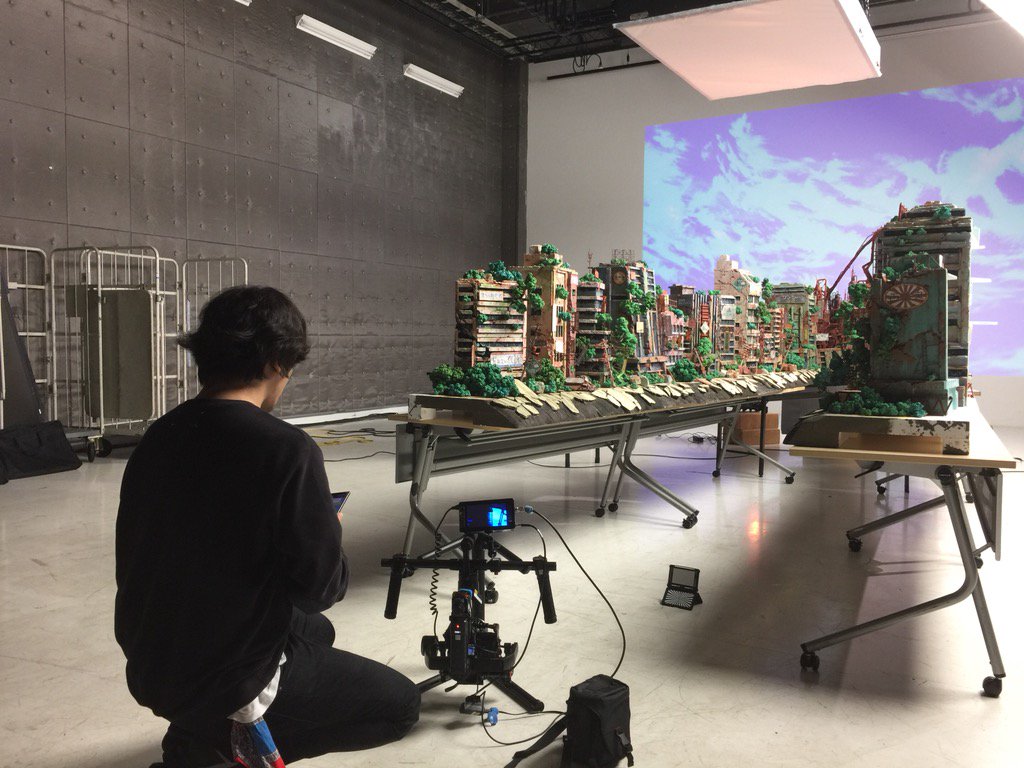
As the first of those experiments, We’re Still Underground set a tremendously high bar. Its focus on escapism, longing for a different reality, and making difficult decisions is expertly underlined by Kaneko’s art direction; all the beautiful, evocative art is almost a given with his team, but I find it particularly interesting how he uses the contrast between a bright and lively apocalyptic setting with the peaceful but dull real surroundings to express how taking that first step isn’t so easy even if we desire change. And since deliberate artistry isn’t antithetical with having fun in the process, Kaneko went through the entirely needless but awesome process of building practical backgrounds of the ruined city. As wary as I am of big corporations, TOHO’s collaboration with Eve has opened a door to ridiculously exciting works like this.
- Best Color Design: Raison d’être (Ryouta Katsuta, Masaki Yamamoto)
And to prove my previous point, here’s another excellent Eve music video that arrived later into 2019. Depending on who you ask, Raison d’être is a short film about accepting one’s true identity and transitioning, a kickass music video that fits nicely within Eve’s interconnected universe, or both of them. And no matter who you ask, they’ll agree that it’s just gorgeous.
This is another case where I could have nominated it for any aesthetic category and presented a convincing argument; the sharp character designs by Mai Yoneyama came pretty close to taking that crown, for one. But in the end, the aspect that stood out to me the most is its elegant usage of color to express that inner conflict, weaving color design into the understated narrative itself. And for that, I have to give major props not just to the designers Ryouta Katsuta and Masaki Yamamoto, but also director Ryu Nakayama himself.
Honorable mention: Though it blends into the territory of compositing and directing as well, my short stay in Fire Force still let me really appreciate its usage of the uniform’s reflective bands as literal shining beacons of hope.
- Best Compositing: Demon Slayer: Kimetsu no Yaiba (Yuichi Terao)
Though there hasn’t been a title that captured me with its aesthetic in the same way Liz and the Blue Bird did last time, 2019 is a year I’ll remember as moments. For example, the expert regulation of lighting mid-scene in Stars Align #05, which also led to my discovery of episode director Shouko Shida; her nuanced lighting work and the way she used the digital techniques she learned in her formative stages to enhance the harshest moments were definitely some of my best worst experiences watching anime this year. At its best, Hikaru Yamaguchi’s direction in Given hit similar notes.
And thinking about it, the title that had the most moments for me was… Demon Slayer: Kimetsu no Yaiba, somewhat surprisingly. I’ve always been a bit torn on photographyPhotography (撮影, Satsuei): The marriage of elements produced by different departments into a finished picture, involving filtering to make it more harmonious. A name inherited from the past, when cameras were actually used during this process. director Yuichi Terao and his unique, studio-defining role at Ufotable. There’s no denying that his technical skill is outstanding, but the way it can obfuscate not just the animators but the directors themselves can be a bit offputting, especially on titles where his photorealistic granular approach isn’t a natural fit. But while I had my worries that he would clash with Demon Slayer, in the end he had a massively positive net effect on it. Sure, I might not like the contrast between the thick character art and the photorealistic snow in the first episode, but that pales in comparison to his jaw-dropping treatment of Nozomu Abe’s animation, Tanjiro’s already iconic Kanagawa-style waves, or the way fully composited scenes like this can be integrated without people even noticing.
As if to show off, Terao wrapped up the show by personally storyboarding the last appearance of the show’s villain, channeling Satoshi Kon’s energy and warping space itself in deliberately disorienting ways to showcase just how terrifying they are. I’ve had my doubts about the series and his compositing style, but in the face of this, I can only accept my defeat. You win this time, Terao.
Support us on Patreon to help us reach our new goal to sustain the animation archive at Sakugabooru, SakugaSakuga (作画): Technically drawing pictures but more specifically animation. Western fans have long since appropriated the word to refer to instances of particularly good animation, in the same way that a subset of Japanese fans do. Pretty integral to our sites' brand. Video on Youtube, as well as this SakugaSakuga (作画): Technically drawing pictures but more specifically animation. Western fans have long since appropriated the word to refer to instances of particularly good animation, in the same way that a subset of Japanese fans do. Pretty integral to our sites' brand. Blog. Thanks to everyone who’s helped out so far!
It’s a shame that Children of the sea was so abusive because damn that is a gorgeous looking movie.
I’m gonna read this one later because I haven’t seen some of the anime (music videos especially) and they look interesting
Didn’t expect so much Black Fox representation in the ‘artsy’ awards lol, I’m happy. Looking forward to the next categories!
I was honestly not surprised when the submissions started rolling in. As conventional as they may appear, they’re damn good on technical terms and led to the movie being kinda adorable. Not all designs need to be radically inventive to fulfill their goals and BLACKFOX is a great example of that.
Excuse me for a moment, but where is Totsukuni no Shoujo? Not even an honorable mention? I am somewhat disappointed
Good on PROMARE and Fire Force being recognized at least
(Spoilers: it’s in tomorrow’s awards finale. Also I wrote a whole piece about it and the WIT branch that made it possible!)
Alright then. I have high hopes for it