Koe no Katachi / A Silent Voice Staff Roundtable: Aesthetics Team
Here’s part two of the Koe no Katachi / A Silent Voice staff roundtable, featuring representatives of various aesthetics departments at KyoAni talking about all the unique processes they had to come up with to produce such a stunning film.
Color DesignerColor Designer (色彩設定/色彩設計, Shikisai Settei/Shikisai Sekkei): The person establishing the show's overall palette. Episodes have their own color coordinator (色指定, Iroshitei) in charge of supervising and supplying painters with the model sheets that particular outing requires, which they might even make themselves if they're tones that weren't already defined by the color designer.: Naomi Ishida
3DCG: Norihiro Tomiita
Art DirectorArt Director (美術監督, bijutsu kantoku): The person in charge of the background art for the series. They draw many artboards that once approved by the series director serve as reference for the backgrounds throughout the series. Coordination within the art department is a must – setting and color designers must work together to craft a coherent world.: Mutsuo Shinohara
Director of PhotographyPhotography (撮影, Satsuei): The marriage of elements produced by different departments into a finished picture, involving filtering to make it more harmonious. A name inherited from the past, when cameras were actually used during this process.: Kazuya Takao
Interview originally published within KyoAni’s 2017 Watashitachi wa, Ima!! books, which are sadly no longer on sale. Translated by megax and checked by bitmap.
A movie that’s not too anime-like
— Please tell us what you paid special attention to in your individual roles for A Silent Voice.
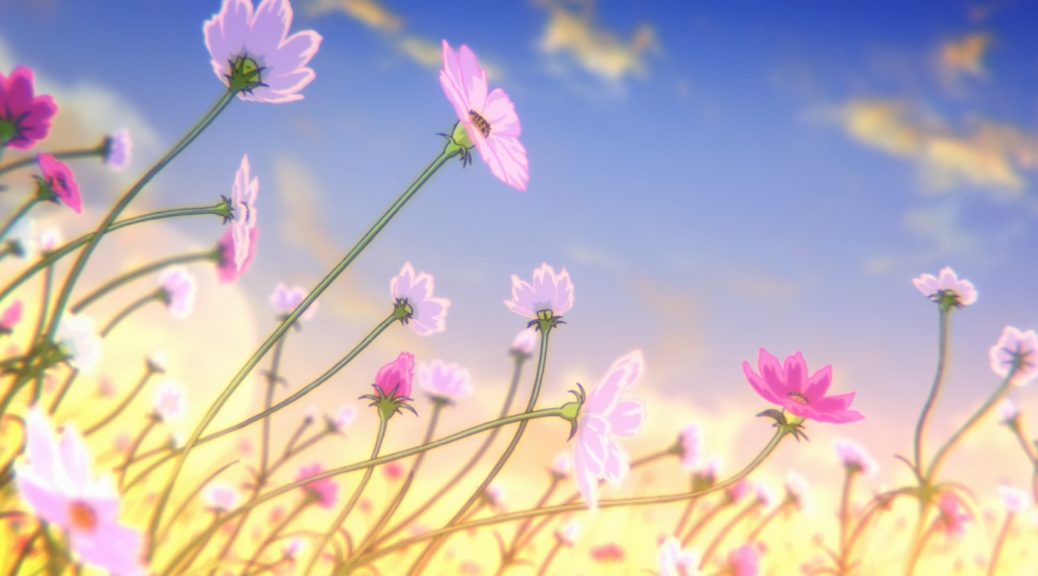
Ishida: When it comes to color design, assigning them to each character, it’s extremely important to strike a good balance with the backgrounds, so I would start by considering the palette while looking at the artboards that Shinohara painted. When we started, director (Naoko) Yamada told me that she wanted them to be attractive but not give off the impression of being too anime-like. So I worked with that mindset: using colors that were pleasant to the eye but weren’t overly vivid, and paying attention to photorealism a bit.
Tomiita: It was the same in the 3D department. For example, when it came to previous works, we would have rendered cars driving by in a single color. But for A Silent Voice, we would keep photorealism in mind and have the surrounding colors reflected on the cars, to avoid the feeling of looking too blatantly anime.
Shinohara: As for the backgrounds, Yamada approached me at the beginning and said “I want the world to look so beautiful that it’s almost scary.” To express how wonderful the world all the characters live in, we strove to make it beautiful by any means, with any dark components taken out—getting rid of any inherent negativity. It took a lot of time and struggle to get there, though. (laughs)
Takao: I think Shinohara must have struggled quite a bit. After all, Yamada was talking in very abstract terms. (laughs)
Ishida: That’s true. It was critical to figure out what Yamada was seeing in her head. She’ll show you specific reference images and the like, but you can’t just use those as-is, so you have to actually go and create something for a proposal, then talk it over again, and repeat that process…
Shinohara: You’re grasping at straws. It’s like a cycle of just drawing and submitting until you stumble upon an answer.
Ishida: Until you find something to act as a base, it really is like stumbling around in the dark.
Takao: Personally, once we had fully settled on the compositing process, I showed Yamada 500 cuts or so that I’d completed. Of course, I ended up having to redo every single one of them.
All: (laugh)
Tomiita: I’m sure there must have been something different when she looked at it all together, as opposed to checking over every single cut on its own.
Takao: It seems as though that was the case. Apparently, something just didn’t feel right when watching them all in sequence. I’ve worked with Yamada this whole time, so I thought I knew what she was looking for even if she didn’t put it into words. But there was a lot of trial and error involved this time around, until I understood what she was hoping to achieve.
— At what points did the painting, background art, and compositing departments work together during production?
Ishida: What stands out in my memory is the desks in Shouya’s elementary school. Their rendering followed a different process than what we’ve used before. Rather than simple digital painting over hand-drawn art, this time around the textures to give them a wooden feel were prepared by the art department and then placed on top. The workflow went as follows: the materials followed the animation pipeline until the digital painting, and then they were passed along to the art department, where that team brought out the thickness and wooden texture of the desks.
Shinohara: That’s right. We call it harmony processing when we use background art to turn the image into something with texture. For the harmony processing, we created several approaches with different uses; we’d use one kind for this kind of close-up of desks, another for different types, and so on.
Ishida: As for which desks used which type of processing, there weren’t clear-cut rules, so we moved forward based on how things looked production-wise at the moment.
Shinohara: That’s right. However, it got to be too complicated, and we realized that we couldn’t proceed smoothly as is. Partway through, one of the art department members compiled and distributed materials on how to handle and perform all of the different harmony processing methods, which was a big help.
Ishida: The viewers are probably paying attention to the characters, so I don’t think it’s something that they would notice very easily.
Takao: Not everything was hand-drawn either—there were desks made using 3DCG as well. Those also had to have textures applied to them one by one.
Tomiita: Since there are cuts where all of the desks in the scene are 3D, we had to adjust them so they had the same textured feel as the hand-drawn ones.
Takao: There aren’t going to be any boring flat-looking desks on my watch! (laughs)
Tomiita: We also paid attention to how shadows would fall across the desks. In the end, we ended up drawing them ourselves at times. The shadows wouldn’t fall where we wanted them with 3D lighting, so we figured it would be faster to just draw them in.
Ishida: There’s also the water plants growing in the Suimon River. We have processing for an underwater look on top of the cel animation, and they ended up becoming very impressive-looking water plants.
Tomiita: Those plants were also trial and error. At first, we had created more photorealistic plants using 3DCG.
Takao: That’s right. At first, we were moving each strand one by one using 3DCG.
Tomiita: In the end, we had to balance things out with the hand-drawn art and went with a more traditional animation-like approach for the plant movement.
Takao: In the film, there are 2D-animated and 3D-animated water plants, and we applied the 3D texture to the cel-animated plants as well so they would have the same feel.
Ishida: Since there are places where we have hand-drawn and 3D plants next to each other, we had to have that processing so they wouldn’t look out of place.
Tomiita: We have some places with 3D carp swimming around in the river amongst the plants, but I was a bit surprised to see the 3D carp used as-is for some fairly close-up cuts as well.
Ishida: We rely quite a bit on 3DCG, don’t we? (laughs)
Tomiita: In theory, we have Yamada or the unit directors decide on a rough size beforehand for 3D assets, but as production went along, we ended up with spots where we had to use 3D at sizes bigger than we had originally anticipated and ended up playing it by ear.
Ishida: How did you create the cut where the acacias are swaying gently?
Tomiita: For that scene, we first worked with it in 3D, and had the directorial staff pass off on the camera work. The background staff painted the acacias which we then composited in. After receiving approval from Yamada, we digitally duplicated it to get the end result. Thinking back on it, we sure did go through a lot of trouble. (laughs)
Shinohara: I had no idea that was what went on behind the scenes.
Tomiita: There are a lot of cuts where we worked together with the art department to create such 3D backgrounds.
Shinohara: Like the scene where Shouya rides his bicycle along the rice fields. The art department painted the assets, and then 3D was used to give it depth—or rather, to bring a greater sense of dimensionality.
The colors of the film
— Were there any difficulties regarding the production of A Silent Voice?
Ishida: I think it would have to be the fact that we didn’t establish a base set of colors for the design sheets, those we usually call normal colors— the standard look that’s iterated upon with extra sheets for specific conditions. For previous works, we’d first decide on a set of normal colors, then use that as the standard and adjust the tones to match the time and locations that the characters were in. But, even though we had an idea of what the palette for this film should roughly be, in the end the colors for each character were essentially decided on a per-scene basis after placing them on top of the background art. Since we went through this unique process of adjusting the colors for each character for those specific backgrounds, I think you’ll find that the characters and background art blend in well in every cut. It took a lot of time and effort so there were worries as to whether we could pull it off to the very end, but I knew there was no other way and faced it head-on by sheer force of will. (laughs)
Shinohara: Just like the painting department, we challenged ourselves and had the backgrounds change color depending on the scene. We painted the same location with different colors depending on the time of day. As a result, we had to draw a new artboard for every single scene. Having come to this point, it would be impossible for me to draw all of them by myself, so I asked for help from other staff members who could draw artboards. There’s a point at which work on the backgrounds can’t proceed without the artboards, so we had to work with everyone in the department helping each other out.
Ishida: There was a lot of passion going into the movie during production, so despite all the hard work and effort we had to put in, we had the determination to see it through to the very end.
Takao: This is very hard for me to say after listening to these stories from everyone at the other departments, but in the end, the compositing team would end up applying blur to everything on screen.
All: (laugh)
Takao: Yamada is fond of blur effects, so no matter how much the animators and background artists draw their asses off for a cut, we’ll show no mercy in applying blur to it. Even as the person doing it, I can’t help but be surprised when we add blur to some of these cuts. (laughs) But according to her, it’s only because everything is drawn out in such detail pre-blur that it pops out on screen later. That’s why we’ve created several different ways of blurring the visuals, even though it’s not something we would do for most of our other works. There’s also the so-called bokeh, where the highlights in the background become circular when blurred—we created a lot of assets to try and match what it looks like in real life. There are times where we warp the bokeh in line with the curvature of the lens at its edges as well.
Tomiita: An unusual bit of 3D work we had to handle is the video game footage that Shouya sees in his head as a kid. When I asked what the game should look like, Yamada replied that it should feel like a retro game ported to a new console. But in the end, we kept it looking retro and pixelated.
Ishida: There wasn’t any traditional animation for the video game, so we first created the 3D models and then threw colors on top.
Tomiita: Video games’ color fidelity increases with every new generation of games, so we figured out how many colors we should have after talking it over with Yamada and Ishida.
Special attention to visual effects
— If you could, please tell us about any new techniques that were unique to A Silent Voice.
Ishida: Whenever we’re painting animation and want to add edge highlights for characters, we tend to, for example, use a whitish pink tone for the highlight of a pink base color. However, for A Silent Voice, we went out of our way to tint the highlight color towards light blue. It’s as if the blue from the sky reflects off the character. And so, in the scene where Shouya rides his bicycle by the rice fields, his dress shirt is also slightly light blue. To blend in with the background, the colors are tuned so that it seems white in the context of the scene, but if you looked at the character art by itself, I think you would find it looking a bit bluish—the blue of adolescence, as Yamada said! (laughs) That said, I also took care to make sure the light blue highlights didn’t stick out on characters like Shouko whose hair contains warm colors.
Shinohara: We did something similar for the backgrounds. We had gotten a request to mix in some light blue into the highlights for the elementary school music room scene, which I guess was the blue of adolescence. (laughs) I thought the highlights were an important part throughout the movie, so I paid special attention to the backgrounds to make sure that the visually impressive parts were as captivating as they should be.
Ishida: Even when characters are backlit, we use brighter colors in A Silent Voice compared to other titles. We wanted the characters to look as though they were in broad daylight at a glance, even when they’re in shadow due to backlighting. By doing so, the parts of the character that are not in shadow will look like they’re shining at the edges, and stand out much like highlights do. In more concrete terms, you can look at the second key visual, where Shouya and Shouko are slightly backlit. I think it goes back to what Yamada said when we began about it being so beautiful that it’s almost scary, but aside from some truly dark scenes, we made A Silent Voice retain as much light as possible, even in the shadows. Even for emotionally painful or heavy scenes, we keep the colors light, so that its beauty isn’t lost.
Shinohara: That’s right. To compare it to another title from our studio, Sound! Euphonium has its appeal in how the silhouettes created by shadows and the use of black carve out the screen. On the other hand, you could say that A Silent Voice uses the whites of its highlights to divide up the screen. When you’re told that you want the backgrounds to be beautiful, the instinct is to take that to mean something sparkly and crank up the vividness, but a vivid look was not what we were aiming for with A Silent Voice.
Ishida: That’s right. It was important that we keep the color saturation on the lower end.
Shinohara: I feel like the intent was to achieve a gentle feel to the art, like a sunny spring day that exudes warmth. Also, to make sure it didn’t feel harsh, we avoided straight lines as much as we could. To give as much of a gentle, freehanded feeling as possible, we went out of our way to make the lines shaky when we had to draw straight lines.
Ishida: As for the color palette, it’s close to what you would think of as milky or pastel colors. For the clothes that Shouya’s classmates wear as kids, I had expected something more childish using primary colors, but Yamada wanted me to lower the saturation and make it more plain-looking. In the end, the palette is still colorful, but in a more photorealistic way that turns down the vividness, and we adjusted the colors so that taken as a whole, your eyes are not drawn to any one particular character. At first, we were going to have some patterned designs as well, but most of the kids ended up with plain clothes so as to not stand out.
Takao: In the key visual mentioned earlier, there’s a ghosting effect applied around Shouko and Shouya’s legs. This was my own suggestion, but I feel like by putting it in, it suddenly felt much more like a work directed by Naoko Yamada.
Ishida: It does seem like the sort of effect that Yamada would like, and more than anything else, it looks great.
Takao: There were times when it was hard to understand Yamada’s sensibilities, but as production continued, it feels like my own began to approach hers before I knew it. That was the moment when I felt like I had fully grasped the root of what Yamada saw in her head.
Ishida: I did feel that visually, A Silent Voice had finally taken shape around the time the second key visual was completed. And we could always look back at this for reference while crafting actual footage.
Tomiita: This isn’t a technical innovation or anything, but it was the first time we created 3D models before we got the storyboards. (laughs) Usually, we create the necessary 3D models after looking at the storyboards, but knowing that there was going to be an amusement park, we went ahead and created models of amusement rides that we thought we might need, with the idea that it would be better to have more assets. There were a bunch of rides that got shelved, but we had them ready so that we could use them, should the occasion arise. We also created 3D backgrounds for the festival scene that we ultimately did not use. Since we started preparations early, there was a lot that we made but didn’t use, but I believe that it was thanks to this that the production went so smoothly.
— Finally, please tell us about any memories you have from working on the film.
Ishida: Prop designer (Seiichi) Akitake was responsible for the reference photographs for the shots of dead animals that Yuzuru takes, which were quite shocking to look at… When he put them all together with the designs, though, it came with a content warning, and I appreciated that courtesy. I felt the casual kindness of our staff members.
Shinohara: We used both animation layers and background art to depict Yuzuru’s photographs.
Ishida: There was also a detailed diagram of how all the photographs should be arranged, and we made sure that there were no discrepancies between those the art department painted and those that followed the animation pipeline. They might all look like background art if you don’t look closely, though.
Takao: Oh yeah, I went on a scouting trip with the rest of the compositing team! That’s usually a job reserved for just the main staff, but I’m glad we went as a team so we could all share the same image in our heads.
Ishida: There’s certainly not a lot of times where the team themselves go scouting.
Tomiita: I went about once a week to the locations we used as models. (laughs) I climbed up the mountain and went to the amusement park, too.
Shinohara: Speaking of scouting, the producer and I took a trip by ourselves to get a sense of the mood, prior to the main staff scouting trip. It was a valuable opportunity, but the part that stands out most was the fact that it was just the two of us. (laughs) I’ve been involved with a lot of titles, but that was the first time taking a two-person trip.
Ishida: The most memorable part was the cut of the social services building in Shouko’s dream, which used background animation—that is to say, all the surroundings are animated by hand, then the entire screen is painted in the following process. When the digital painting team has to handle the background, what usually happens is that they use the colors from the artboards as a base… but since this cut takes place in Shouko’s imagination within her dream rather than an actual setting, there wasn’t an artboard. Which meant we had to start off by thinking about what to use as a base for coloring. Stuff like the reflections on the floor were all done by in-betweeners on different sheets with quite the amount of detail, then we all worked very hard to paint what was a considerable amount of drawings. And when we saw the footage after the compositing process, most of it ended up being blurred… (laughs) I’m sure everyone on the team who had worked on that must have been shocked. (laughs)
Takao: That compositing wasn’t my fault! It was what Yamada wanted! (laughs) But she was impressed when she checked over the footage, saying that it turned out to be an excellent scene. I felt that my efforts had been worth it after hearing that, and I think that in the end the cut stands out even taking the movie as a whole. It really was a film that allowed all members from each department to show the full extent of our abilities.
— Thank you for your time today.
Support us on Patreon to help us reach our new goal to sustain the animation archive at Sakugabooru, SakugaSakuga (作画): Technically drawing pictures but more specifically animation. Western fans have long since appropriated the word to refer to instances of particularly good animation, in the same way that a subset of Japanese fans do. Pretty integral to our sites' brand. Video on Youtube, as well as this SakugaSakuga (作画): Technically drawing pictures but more specifically animation. Western fans have long since appropriated the word to refer to instances of particularly good animation, in the same way that a subset of Japanese fans do. Pretty integral to our sites' brand. Blog. Thanks to everyone who’s helped out so far!
Aesthetic Team! Pls do a part 2 of it 🇯🇵❤️❤️❤️❤️❤️💛💛💛
Amazing!
wow this was beautiful and mindblowing.