Land of the Lustrous / Houseki no Kuni Production Notes 1-6
Now that Land of the Lustrous is at its halfway point, it feels like a good moment to look into the intertwined creative decisions that have led to such a special series, as an adaptation and on its own right. The staff have been fairly open about the production process too, which means we can peek behind the scenes a bit to look at their craft and the mindset behind it. Hopefully this will deepen your appreciation of the show, or finally convince you to give it a try!
─ A very interesting point brought up by series directorSeries Director: (監督, kantoku): The person in charge of the entire production, both as a creative decision-maker and final supervisor. They outrank the rest of the staff and ultimately have the last word. Series with different levels of directors do exist however – Chief Director, Assistant Director, Series Episode Director, all sorts of non-standard roles. The hierarchy in those instances is a case by case scenario. Kyougoku in the interview we published a few weeks back was that while he perceived the intentional ambiguity of the series as one of its main assets, he had the duty to make certain aspects clearer for the adaptation. This is by no means dumbing down the material, but rather the kind of awareness that all capable directors develop – medium specificity doesn’t just refer to the tools that each format has at its disposal, it’s also a matter of how things are consumed. Eyes linger in different ways with comics and animation, and even the availability (especially if you treat the adaptation as a TV program, which Kyougoku had to) is different. That means he had to strike a balance where information had to be conveyed more clearly, but not overdoing it as not to shatter the appealing vagueness of the setting. No easy task, but I feel like he’s done an exceptional job alongside the rest of the team.
─ The characterization has also been affected by Kyougoku’s approach, as well as reshaped by the particularities of this production. It’s fair to say that while the gems do feel emotions in the original manga, there’s this curious sense of emotional sterility to it; again a premeditated choice by the author Haruko Ichikawa, and one that makes a lot of sense when you consider that it’s a series about rock people. The anime spices things up in a way that conveys everyone’s feelings more clearly, following Kyougoku’s vision for the adaptation. And as he pointed out, Phos’ lively yet somewhat lethargic character has been influenced by Tomoyo Kurosawa’s fantastic voice acting. That wouldn’t normally be possible in anime, but since this time around the voices are recorded before the animation process (a practice known in Japan as “pre-scoring“, as opposed to the usual “after-recording“), it’s actually feasible to have her performance as the acting guide. Land of the Lustrous is a fascinating showcase of interwoven visions leading to a genuine reinterpretation of an already excellent work. We don’t get many adaptations of this caliber.
─ I’ve encountered fans surprised by the exceptional job the staff is doing. Kyougoku doesn’t get much credit since Love Live is hardly a critical darling and GATE is understandably reviled, but that overlooks the qualities he’s been showing for a long time. Sure his idol behemoth isn’t an inventive masterpiece, but it was him who developed its amusing tradition of visual gags. That has continued even after his departure from the franchise, which makes this project fairly amusing – the original director and designer duo (Kyougoku/Nishida) who brought Love Live to life have moved onto this fascinating project, while their old series is still stuck on the exact aesthetic they defined. And if we look back at Kyougoku himself, it’s also worth highlighting that his previous TV project Aku no Gundan was a very interesting fully digital production, which is a perfect warm-up for this.
─ The strong direction isn’t limited to a conceptual level. Admittedly I had my gripes early on: it’s hard to compete with a source material that feels more like a series of illustrations than an actual comic, with an eye-catching calculated composition in many panels that are worth admiring on their own. The camera also seemed a bit hyperactive even in downtime scenes, as if it were too eager to prove how effortless it is to have a dynamic POV when compared to 2D anime. And by Kyougoku’s own admission, he’s far from an action expert. Thankfully, all of those went from minor issues to essentially non-elements – the storyboards get more compelling by the episode, the camera has settled down to more comfortable levels, and Orange’s experienced staff have been given fairly free rein when it comes to the fights. Not to say it’s not perfect, but this might be as close as it gets.
─ As much as I’ve been praising the series director – and don’t get me wrong, his episodes are fantastic – it’s someone else who has impressed me the most: Kenji Mutou, who storyboarded and directed the third and sixth episodes. One day I’d like to write about the factors that make an anime storyboardStoryboard (絵コンテ, ekonte): The blueprints of animation. A series of usually simple drawings serving as anime's visual script, drawn on special sheets with fields for the animation cut number, notes for the staff and the matching lines of dialogue. good with the collaboration of some industry folks, since the things we value aren’t necessarily the same as they do, but it’s fair to say that his work has accomplished many goals. For starters it’s very easy to read, which is to say that all his scenes can be immediately interpreted even if you stripped them of context; colors, composition, the atmosphere he’s depicting always seems to come across very clearly. And on top of that, he has the sense to put together countless striking shots. Now that gets often written off as it’s just pretty animation, but that’s obviously doing a disservice to all the intentionally evocative imagery. I have to admit that Mutou wasn’t on my radar at all until this series, so this has been a sweet surprise. His student work looks very impressive, so perhaps things would have been quite different if the Anime Mirai project he was meant to direct in 2013 (the same year that Little Witch Academia and Death Billiards happened) hadn’t been cancelled. Instead of that, he joined MAPPA where he’s been doing fairly nondescript work for years, only blossoming now that he’s gone freelance. The studio does have recurring issues inhibiting creative directors, so this might have been for the better. For now, I’m adoring his output here.
─ I can spare you the talk about the art direction, since I already addressed it in a recent article about the most striking settings of fall 2017 anime. The entire team is doing a fantastic job, but I’d love to see Yohichi Nishikawa getting more leading roles in TV anime after this. It’s hard not to fall in love with his concept art.

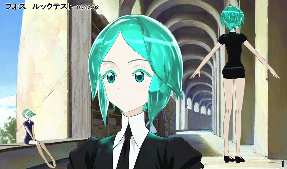
─ Land of the Lustrous keeps being referred to as a fully 3DCG production, which it is… except it’s not. Truth to be told, 3D anime that doesn’t go for a photorealistic vibe always has a hand drawn component to it, but this honestly takes it to another level: right about any close-up, especially those that need to depict nuance, is actually a 2D drawing. As advanced of a CG effort as it is for this industry, the staff are plenty aware that the delicacy in the movement isn’t there yet, and that a close look at hand drawn art is simply more appealing. Even the gems’ exaggerated faces, which are delightfully expressive for a project like this, switch from 2D-inspired reactions to outright 2D ones every now and then. Effects animation – water and smoke in particular, as opposed to something more dense like Cinnabar’s attacks – also tends to get that treatment, as well as complex cuts where texture is important. And yet the show still feels like it’s confidently presenting itself as a CG series, rather than a replica of standard anime aesthetics using 2D crutches. I don’t think there’s one single correct path for 3D anime to advance through, but this one is perfectly valid and they’re doing a great job with it.
─ That said, there’s one particular kind of 2D work in the series that is worth thinking about on its own. When it comes to regular anime, 3D beings are often coded as weird and exotic – an easy but effective trick to exploit the contrast between those and normal hand drawn humans. In this case though, with 3D on the dominant role, it’s the alien-looking Lunarians and Admirabilis who are often presented as 2D art, while the much more anthropomorphic gems are regularly 3D. It would seem that reversing the nature of the production as a whole also inverted that, but did it really? If the legends as told by Ventricosus are to be believed, then their race as animals and the flesh, and the Lunarians representing the soul, are much closer to what we perceive as normal life than sentient rocks. So in the end, maybe nothing’s changed from the usual approach! Chances are that this isn’t a conscious decision at all, but it’s neat nonetheless.
─ This is a bit of a teaser since we plan to translate their feature as a whole, but CGWORLD has been sharing interesting information regarding the production of this series. The staff again admit that it was always envisioned as a 3D production because that felt like the best way to portray the appearance of gems in an appropriate way, and they share many details about their precise operations. Emulating the caustics was one of the key elements, since they really wanted the hair to feel like glittering clear parts in constant flow, except maintaining a form. They spent months tweaking the settings until they achieved the current results, which speaks volumes of how much they cared about portraying the characters as actual gems.
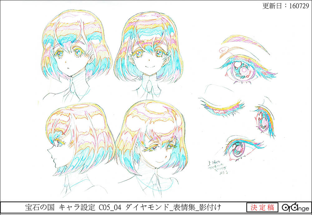
─ On that note about the lighting effects being a core aspect of this production, and as I mentioned on Twitter, there’s one thing I can’t get enough of: having the directors change the predominant lighting according to whose presence dominates a scene is a neat trick that feels more fitting here than in any other show. Dia’s introduction was breathtaking on its own right, and it served to underline the blinding existence of a diamond class gem when compared to someone like Phos. This show is offensively good to be honest.
─ After half the series, and knowing the upcoming staff for the next month, it’s now obvious that this production only has three essentially invariable teams. If you’ve ever looked at the credits of standard anime, you’ll know that even the rare stable productions that manage to keep a solid rotation within one cours require more teams than that. This is obviously a consequence of its very ample schedule, as we know it’s been in active production since early 2016 – if it weren’t for that, there’s no way they could all have afforded to handle so many episodes! It’s worth noting that to make this feasible in the first place, studio Orange has had to temporarily double the number of contracted people, going from around fifty to over one hundred. There’s no doubt that they bet a lot in their first independent production, so I hope their fantastic work pays off.
Episodes 1, 2, 5
StoryboardStoryboard (絵コンテ, ekonte): The blueprints of animation. A series of usually simple drawings serving as anime's visual script, drawn on special sheets with fields for the animation cut number, notes for the staff and the matching lines of dialogue., Episode DirectionEpisode Direction (演出, enshutsu): A creative but also coordinative task, as it entails supervising the many departments and artists involved in the production of an episode – approving animation layouts alongside the Animation Director, overseeing the work of the photography team, the art department, CG staff... The role also exists in movies, refering to the individuals similarly in charge of segments of the film.: Takahiko Kyougoku
CG Director: Kunio Mogi
Episodes 3, 6
StoryboardStoryboard (絵コンテ, ekonte): The blueprints of animation. A series of usually simple drawings serving as anime's visual script, drawn on special sheets with fields for the animation cut number, notes for the staff and the matching lines of dialogue., Episode DirectionEpisode Direction (演出, enshutsu): A creative but also coordinative task, as it entails supervising the many departments and artists involved in the production of an episode – approving animation layouts alongside the Animation Director, overseeing the work of the photography team, the art department, CG staff... The role also exists in movies, refering to the individuals similarly in charge of segments of the film.: Kenji Mutou
CG Director: Yuuji Koshida
Episode 4
StoryboardStoryboard (絵コンテ, ekonte): The blueprints of animation. A series of usually simple drawings serving as anime's visual script, drawn on special sheets with fields for the animation cut number, notes for the staff and the matching lines of dialogue.: Kotaro Tamura
Episode DirectionEpisode Direction (演出, enshutsu): A creative but also coordinative task, as it entails supervising the many departments and artists involved in the production of an episode – approving animation layouts alongside the Animation Director, overseeing the work of the photography team, the art department, CG staff... The role also exists in movies, refering to the individuals similarly in charge of segments of the film.: Shinichi Matsumi
CG Director: Takayuki Miyakoda
Support us on Patreon to help us reach our new goal to sustain the animation archive at Sakugabooru, SakugaSakuga (作画): Technically drawing pictures but more specifically animation. Western fans have long since appropriated the word to refer to instances of particularly good animation, in the same way that a subset of Japanese fans do. Pretty integral to our sites' brand. Video on Youtube, as well as this SakugaSakuga (作画): Technically drawing pictures but more specifically animation. Western fans have long since appropriated the word to refer to instances of particularly good animation, in the same way that a subset of Japanese fans do. Pretty integral to our sites' brand. Blog. Thanks to everyone who’s helped out so far!
Eagerly awaiting your translation of the CG World article.
Glad to you mentioned Kenji Muto, i’ve been following (and praising) him since his awesome opening for Hajime no Ippo: Rising that is one of the most powerful openings of this decade easily: https://www.youtube.com/watch?v=GfwHsqOOTpc that feature some of the best Madhouse and Pierrot animators animating his storyboard (Masayuki Kouda, Ichiro Uno, Hiromi Ishigami, Hidehiko Sawada, Takashi Tomioka, etc)
Also, +1000 hipster points for knowing and praising a newcomer director or animator before Kvin.
You’ve got a good eye then! We’ve talked about this before but MAPPA tends to act as shackles for these very unique directors, so I’m not surprised his work is now much more attractive then it had generally been. Especially on a show like this, which feels like it’s in the opposite end of the spectrum – not even Kyougoku’s output had looked this beautiful before.
Out of curiosity can clear up how shackles these directors? Is it in the sense of their lack of proper project management or is it like a “you can only be this creative or you alienate the viewers” kind of thing?
I don’t think it’s an intentional limitation at all, if anything the people running the company consistently aim at… if not inventive, at least unusual stuff. But at the end of the day the TV output of their unique directors ends up being very workmanlike, so it’s hard to imagine the questionable management isn’t hurting them.