Card Captor Sakura: Then and Now
Card Captor Sakura is getting, amongst many other things, a new anime project as part of its 20th anniversary campaign. It has reunited part of its original crew, but their approach isn’t quite the same this time. Aesthetic trends have changed a lot over the years, as well as the way in which anime is produced to begin with, and it all has an effect on the final product. Rather than just scream about anime not being as good as it used to be, let’s run down the ways in which the new CCS anime is shaping up to be different…and yes, if you ask me, worse.
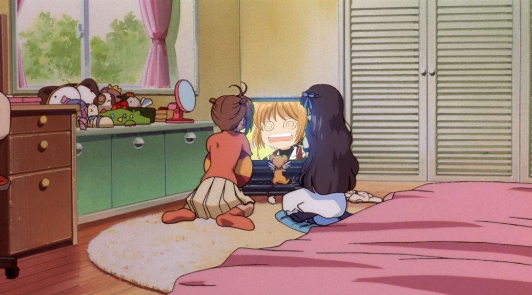
The new Card Captor Sakura anime isn’t looking very good. And I don’t say this because its prologue OVA stomped on the original series’ beautiful finale and its second film, although that’s also not the best way to earn my sympathy. The reason I was preemptively wary, and have only grown more disappointed after giving it a try, has more to do with questionable artistic decisions – visual ones for the most part, but with tangible impact on the direction nonetheless. People who follow the site are aware that I’d much rather ramble about anime’s triumphs than write pieces entirely about its shortcomings, but I feel like properly addressing these issues would be for the better. Since the internet has the nuance of a nail hammer on fire, if I had just tweeted that “the original CCS anime looked much better”, it would quickly devolve into tired debates about how cartoons used to be much better when we were children. A quick look at the precise changes in this case seems like a much better way to tackle the situation.
Let’s preface this by making it clear that Card Captor Sakura hasn’t been cursed with one of the disastrous revival campaigns that fans have been suffering over the last few years. This is neither Card Captor Super nor Sakura Crystal, as there’s enough of a semblance of competence and polish to justify being attached to its franchise. In this case, they went as far as to keep the same director of the original series to ensure that it was in the hands of someone who truly knew the franchise. Sadly, that might have been their first, perhaps biggest mistake. Morio Asaka had his TV series direction debut with CCS to begin with, and ever since then he’s been one of Madhouse’s most reliable assets. After the studio essentially fell apart he remained there as a very active figure, so it would be no exaggeration to claim he’s their flagship director at the moment. A truly versatile creator who feels like no matter the genre he can do no wrong…but lately struggles to truly do right, as far as I’m concerned.
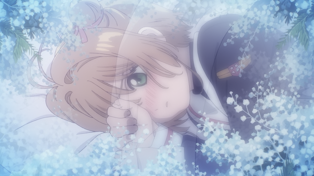
Starting with his take on Chihayafuru, Morio’s approach to all works majorly aimed at girls has been defined by their nondescript pleasant, fluffy, ornate look. In that case it was as its most flowery when accentuating Chihaya’s gracefulness, which worked decently enough in the end. The Ore Monogatari adaptation took it to a whole new level, inundating the show with the quintessential shoujo bubbles and sparkles. Takeo is the most romantic person despite his brute appearance, so the outrageous ornaments also felt like a fitting exaggeration, whether intentional or not. And then comes the new Card Captor Sakura, which maintains the same approach with no apparent justification for it. There’s no end to these shots with intrusive bloom and flowery decorations. They’re not exactly aesthetically pleasing, the infamous MADBOX haze (almost ever-present in titles where they handle the composite) makes it feel like you’re watching a cartoon from within the fog, and through simple overuse these situations all feel pointless to begin with; when entire scenes are composed by insipid attempts at making a moment feel special, nothing is special anymore.
The original series had its moments of heightened presentation of course, but this new take feels immensely clumsy, both by contrast and judged on its own. Fans will react to this by accurately pointing out that CLAMP are very fond of these embellishments, which I don’t quite buy as an excuse since tricks that (arguably) work in one medium don’t necessarily translate well into other formats. The effect of an adorned page and a sequence with a dozen consecutive shots bathed in various indistinct “special” lighting isn’t the same – the latter feels clunky and only devalues itself more the further it goes on. And that’s where this stops being a visual problem and truly starts affecting the experience of the viewer. What begins with a bland coat of paint leads to awkward progression, and over-eagerness to sell every instant as a touching moment makes it so that none of them are.
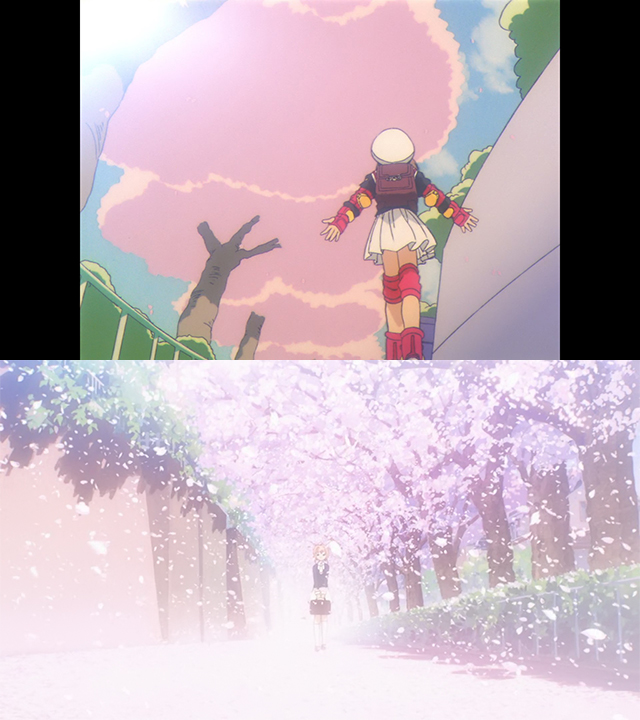
On a project that struggles to leave an impression, it really doesn’t help that Morio’s team this time decided to show bizarre restraint when it comes to the palette, painting an almost pastel world when it used to be a vibrant one. This isn’t conceptually an awful idea, but it’s such a weird decision for a series with as much energy as Card Captor Sakura. The series’ original bold colors are gone, and their replacement is simply dull and lifeless. It’s worth noting that the first TV show and the films happened in the cel era, which did default to brighter colors, both due to prevailing trends and the painting method itself. That said, as anyone who actually watches anime nowadays can attest, it’s still perfectly feasible to have equally lively colors nowadays. Why did they shy away from it then? This might be another attempt to stay closer to CLAMP’s style, and again one that I would consider a misguided effort. Illustration work doesn’t have the same duty to continuously bring to life a world, the tone doesn’t fit its titular character to begin with, and it’s not even a good muted palette (which is doable!). Out of all issues with the new anime, the color downgrade might actually be the most apparent one. It’ll be hard to come to terms with the fact that daytime scenes are now less vibrant than an average CCS night used to be.
I couldn’t end this without addressing the new character designs, which I’m not terribly fond of but have honestly grown to tolerate. They feel worth bringing up though, since they again steer closer to CLAMP’s work than before. While Morio Asaka returned to direct, the original character designer Kumiko Takahashi declined the opportunity. She’s still active and recently served as the animation designer on Snow White with the Red Hair, showcasing the sensibilities that would have elevated CCS once again. Her replacement is none other than Kunihiko Hamada, Morio’s most trusted partner as of late who had already supervised a couple of episodes in the original series. If they were going to choose an animator with ties to the original series and who’s still willing to work on it, Mariko Fujita honestly feels like a much better choice. Not only is her style more attractive, she’s trustworthy to the point that she was the animation director in charge of the show’s finale. A missed opportunity here! Hamada’s take on Sakura widened her facial features in a way that makes her look a bit dopey at times, and as animation designs his work doesn’t seem particularly malleable. His designs feel more preoccupied about emulating CLAMP’s art than about having to move, though I’m sure many fans will appreciate the extra level of detail. When it comes to this, we can actually say that this new anime is a product of its time. Animators have complained over and over about the increased linecount in TV anime nowadays, which makes their work trickier in many regards, and has undoubtedly reduced anime’s cartoony expression; since it’s hard to pivot from fancy designs to exaggerated forms, funny faces in anime tend to exist as disconnected shots now, rather than being an organic part of a sequence. It would be dishonest to imply that anime reboots can’t take the stylized route and even outdo their original counterparts while GuruGuru is still airing though, so don’t take this as a full exculpation of the new CCS!

In the end, the problems all seem to come down to a misuse to the new tools at the disposal of the series, mostly stemming from a conservative approach to CLAMP’s work. I don’t want this to come across as a tirade against the manga, which I own and rather enjoy, but seeing CCS’ anime get rid of its own personality and replace it with awkward mimicry hurts to see – not only because of what’s already present, but also because of what it says about the attitude of this new anime. Considering all the decisions regarding its aesthetics, I have no reason to believe that the TV show meant to adapt the new Clear Card arc won’t be a slavish reenacting of the comic. And that would be the first time Sakura doesn’t fill me with joy.
Do you know what was a surprisingly great return of a classic magical girl series though? Sailor Moon Crystal season 3.
Support us on Patreon to help us reach our new goal to sustain the animation archive at Sakugabooru, SakugaSakuga (作画): Technically drawing pictures but more specifically animation. Western fans have long since appropriated the word to refer to instances of particularly good animation, in the same way that a subset of Japanese fans do. Pretty integral to our sites' brand. Video on Youtube, as well as this SakugaSakuga (作画): Technically drawing pictures but more specifically animation. Western fans have long since appropriated the word to refer to instances of particularly good animation, in the same way that a subset of Japanese fans do. Pretty integral to our sites' brand. Blog. Thanks to everyone who’s helped out so far!
I did find the near omnipresent blurry filter a distraction and it left me wondering why the choice was ever made to use it. Is it supposed to imbue the scenes with some feeling of atmosphere and romance like there is “something in the air” so to speak or is it perhaps some kind of attempt at creating a sense of filmic depth? Really not sure what the desired effect is from using it.
Closer to the former in my opinion. It’s trying to evoke the feeling of soft, warm teenage love now that they’re a bit older than when it all started. Intent aside though, the execution is just poor. I feel like anime discourse is awkwardly stuck at the stage of arguing whether a technique is used or not, rather than the effectiveness of their execution – which is why there’s so many people with polarized opinions on postprocessing. Personally I side heavily towards adventurous photography departments because I believe creators should use the new tools at their disposal, but I obviously… Read more »
There does seem to be plenty of that all or nothing attitude towards certain techniques in anime discussion rather than assessing each instance on its own merit and what it brings (or doesn’t bring) to the content. Especially in the context of “old vs new” debates referenced in the post. I can understand the cynicism to some extent with some of the notable examples of garish and perhaps tasteless applications of digital processing. However the instances where these kinds of techniques are applied well seem to be generally speaking at best underpraised. Whatever they were going for in this instance… Read more »
To be complete honest, all the changes you disliked I liked a lot, especially the “flowers everywhere” and bubbles from shojo mangas, and trying to keep it “manga-ish” as possible it’s something I really liked from this new adaptation.
That’s how it goes when something isn’t outright broken! There’s one issue that I think is inarguable beyond personal preferences, which is that the effect of embellished shots is cheapened when half the scenes look like that…but even that is less of a problem if you find that look aesthetically appealing to begin with.
Isn’t it supposed to be a continuation of the manga? So the ending of the Anime is irrelevant?
CCS is my favorite anime of all time so I hope you don’t mind the comparison but I honestly felt like I was watching a 2007 yaoi manga adaption. Stiff design to make them look pretty, over the top ethereal shots to give the illusion of weight to the romance, “comedic” faces and moments that change the design completely and feel off…But what I think bothered me the most is that the dialogue was split between those moments. It was almost as if the characters’ conversations and thoughts were waiting for the blurry bubble shots to finish to continue with… Read more »
Im the one fan of sakura i love this anime
Cool article.
I always liked how the 1st Fullmetal Alchemist anime looked compared to the new one Brotherhood . Looks like the same thing is happening with CCS too.
On that note, a lot of people argue the same for the two Hunter x Hunter adaptations (1998 and 2011).
I think art direction was really tight in anime back then. Nowadays there’s much less single-focus direction and series feel less like personal projects and more like big productions as a result. Palettes tend to focus on ‘enhanced realism’ rather than impressionist mood-setting. And then there’s filter abuse.
I know what you two mean, I preffer FMA 2004 and HxH 1999 direction better. But somehow I didn’t felt like that when watchin this Sakura OVA.
hahaha i didnt even have to read this article to know where this was going. No lie, the moment i read the title , I exclaimed “I agree; the old cardcaptor series looked better”
So what did you think of the Clear Card trailer shots?
I thought they were much better than the OVA, and it feels like much of the budget went there. It shows the OVA was more of a side-project for them.
It still has some of the brightness and character design problems mentioned here but it made me more optimistic for the Clear Card Arc.
That’s essentially what I thought too. Much, much better production (misleadingly so? Could be just a very strong first episode) which is still held back by poor design work. Can’t really judge the direction yet but there’s glimpses of more inspired vision there too.