Behind the Scenes of Yuri!!! On Ice’s Costume Design 7
Good Haro is back to translate some more production insight on Yuri!!! on Ice, enjoy!
This time we’ll be talking about the short program costumes from the Rostelecom Cup in episode 8.
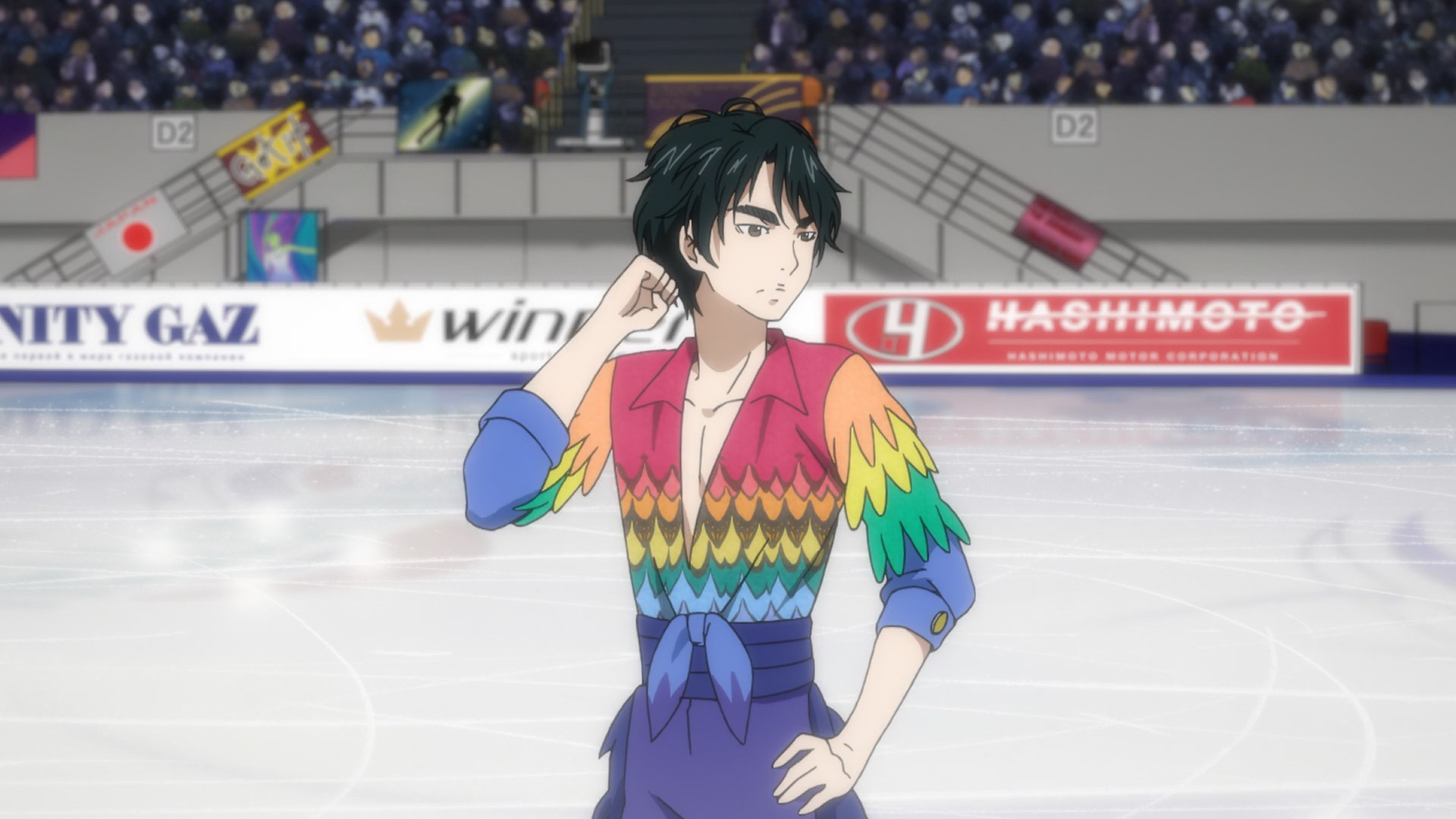
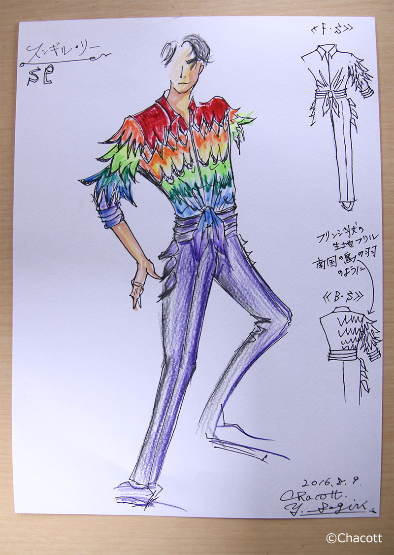
Let’s start off with the first skater to perform in this episode, Seung Gil Lee, and his very colorful costume. The way it came out in the anime is very close to the original design sketch.
The keywords Ms. Yamamoto gave me for this costume were “flashy” “sharp, aggressive footwork” and “dancing like a madman”. I thought the costume should express how––unlike his usual self––when he’s “on” it’s almost like he’s possessed. I went with the rainbow color scheme for the same reason.
To be honest, I actually had custom dyed rainbow stretch mesh fabric on hand and thought it’d be just perfect to accompany a mambo, so that’s where this design got its start. The actual fabric has a feather pattern printed on it in black, breaking up the colors nicely. The sleeves would have fabric cut along those lines and stitched down to the body suit.
The pants would have bene made of a lustrous stretch satin, so [in real life] it might actually be even more flashy than how it looked in the show.
Is the belt portion attached to the top?
The waistband of the pants ended up looking something like a belt. It has tucks in it (pleats) like a cummerbund one might wear with more formal attire.
Next, could you tell us a bit about Jean-Jacques Leroy’s costume?
This was one of the more difficult costumes to design. Ms. Yamamoto gave me the note, “something rock-and-roll with translucent elements”, so I started by deciding on the colors. I settled on something in between a mint green and blue. I hadn’t used that color yet in the designs for the show, and since he’s meant to be popular with both men and women, I wanted something in the green family since greens are said to attract people––but, it ended up being a pale purple in the anime.
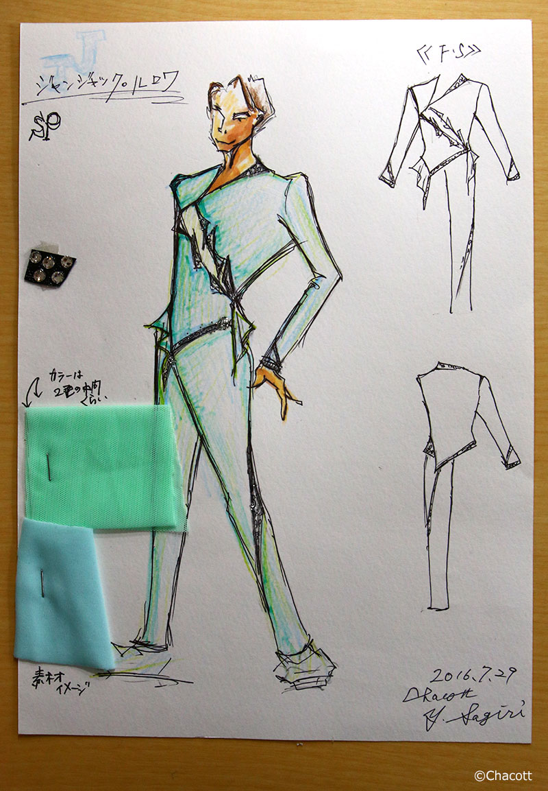
The color might have changed but the cut and appliqué ended up pretty much the same.
Yes. For the appliqué, I was trying to evoke the idea of ice, so I used triangles of fake leather with crystal rhinestones applied one by one on top. I was aiming to use it to pull together the pale color of the rest of the outfit. The sharp V neckline was another highlight.
What is the shape on his chest supposed to be made of?
Transparent white stretch mesh.
Lastly, let’s talk about Michele Crispino’s costume.
I was going for the image of a manly and powerful knight. A chivalrous spirit who wants to save a princess (protect his sister)! The armor-like panels might seem hard at first glance, but they would really be stamped stretch velour. I used a fabric with sequins woven into it to connect the armor panels. The non-armor sections of the top would be stretch mesh with skintone showing through. I also suggested [the possibility of] using a patterned lace instead of plain mesh.
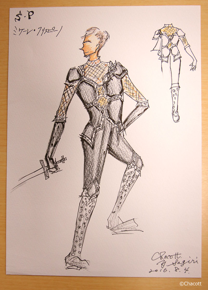
At some angles you can see a fluttery bit of fabric––what is that meant to be?
Michele is a bit of a different sort of “knight” compared to Georgi from the previous competition, so I gave him a bit of a cape starting from the front of his left shoulder. The flutteriness helps emphasize his movements.
Georgi had a boot-look too, but this time the fabric is different, huh.
I used the same fabric for the “boots” as I did for the lines connecting the armor pieces, but to prevent the sequins from catching on each other, I layered mesh over the top.
And that’s it for this installment. I know I can’t wait to see what they’ll all be wearing for their free programs next time! See you next time!
Support us on Patreon so that we can keep producing all this content and fullfill our next goals, as well as affording all server expenses. Thanks!