Koe no Katachi: Character Designer / Chief Animation Director Futoshi Nishiya Interview
Our next Koe no Katachi / A Silent Voice main staff interview gives the spotlight to Futoshi Nishiya, the movie’s character designer and the ultimate supervisor of its animation as chief animation directorChief Animation Director (総作画監督, Sou Sakuga Kantoku): Often an overall credit that tends to be in the hands of the character designer, though as of late messy projects with multiple Chief ADs have increased in number; moreso than the regular animation directors, their job is to ensure the characters look like they're supposed to. Consistency is their goal, which they will enforce as much as they want (and can).. Nishiya details the attempts to integrate the heart of the characters into the designs themselves, and mentions some of the film’s idiosyncratic points like the expression through drawings of hands and the textured linework. Tune in for all of that and some more!
Koe no Katachi Character Designer and Chief Animation Director Interview
Futoshi Nishiya
– First, please tell us how did you feel when it was decided that you would be in charge of the character designs of A Silent Voice.
As soon as I knew of the plans to adapt A Silent Voice, I felt that animating this title would a very fulfilling job. That said, I hadn’t even considered that I would be appointed as the character designer and chief animation directorChief Animation Director (総作画監督, Sou Sakuga Kantoku): Often an overall credit that tends to be in the hands of the character designer, though as of late messy projects with multiple Chief ADs have increased in number; moreso than the regular animation directors, their job is to ensure the characters look like they're supposed to. Consistency is their goal, which they will enforce as much as they want (and can).. I had read the manga beforehand and was profoundly charmed by the rich emotions of the characters and how it portrayed problems with no straightforward solutions. I also couldn’t look away from the details drawn in the manga. I loved the pictures Ooima-sensei drew, so I was incredibly pleased that I got to design the movie’s characters and supervise the animation.
– This was the first time you served as character designer for one of director Yamada’s works. How did that go?
I’d been hoping to be involved with one of director Yamada’s titles as part of the main staff. But to be honest, since her direction and storyboards are stuffed with a special sense that only she has, I was a bit nervous that I wouldn’t be able to translate her technique and unique feel into animation. As if to address my worries, during early stages of production she told me that she felt that the characters’ presence would be best represented with designs somewhat between realism and anime-style. I was relieved as that was similar to the kind of image I had in mind for this title. I didn’t want to go overboard with the realism, since as an artist I always look out to maintain a balance between stylization and life that still leads to charming drawings. I carefully considered that when I started working on the film.
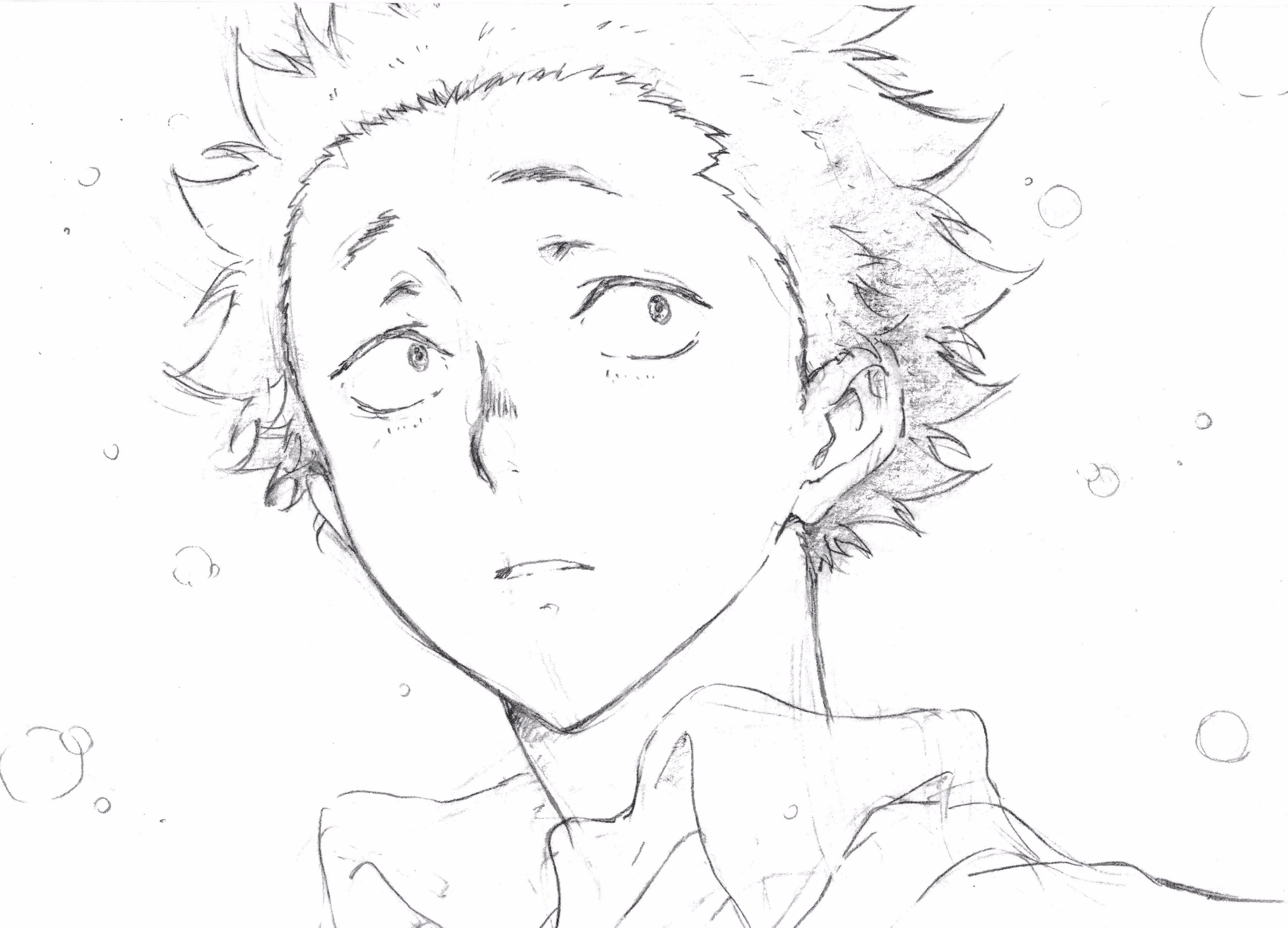
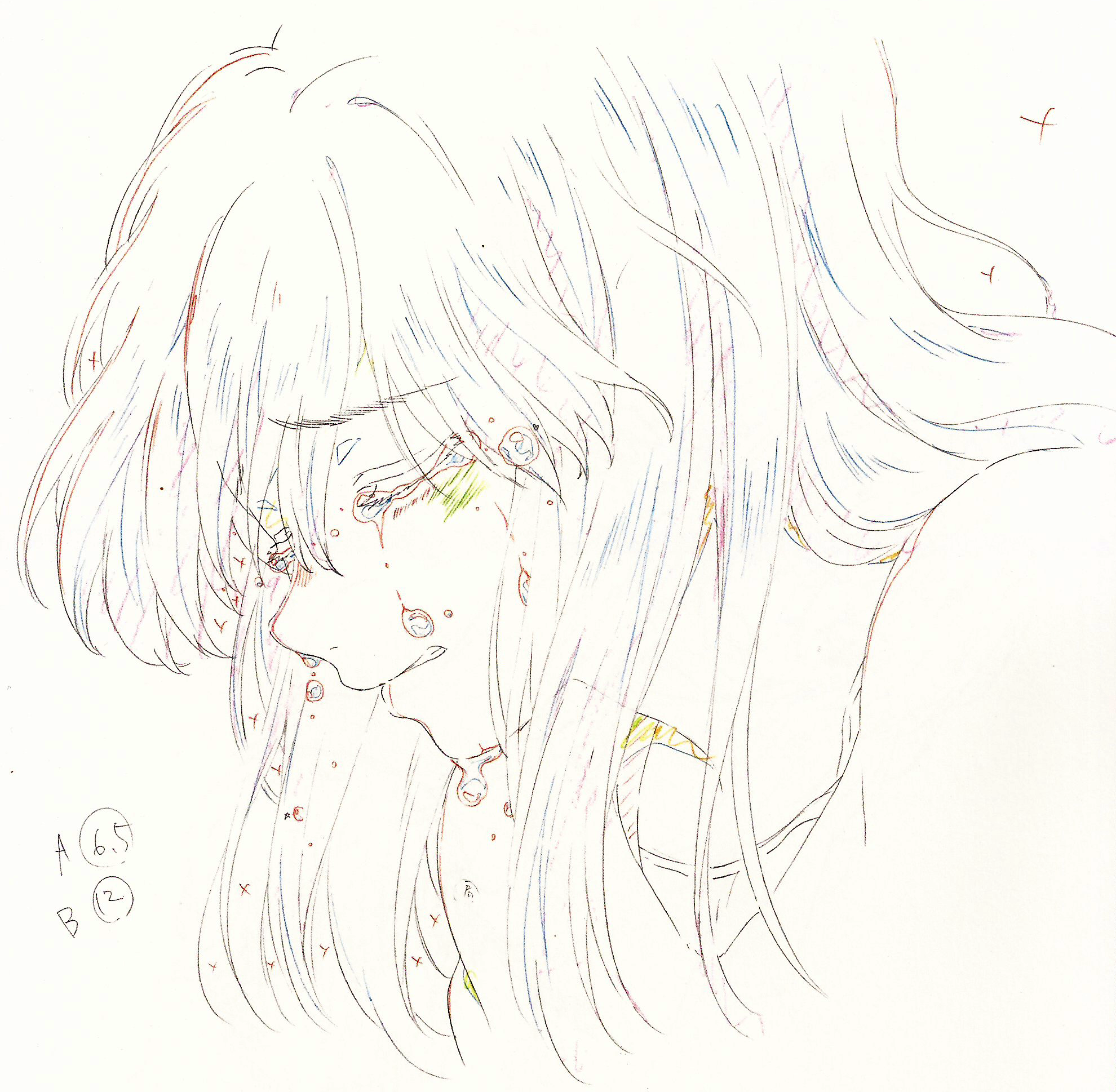
– Isn’t this the drawing of Shouya you drew during the start of production?
This is an early sketch I drew of him while still experimenting. Compared to the final version, this has a slightly sharper feel. When I drew that, I was in the middle of picking up bits and pieces from the art in the manga.
– You mentioned earlier that you loved the art of the manga. Which elements did you find charming about it?
Perhaps that’s more of a common necessity in manga, but each expression didn’t feel fixed and every panel drew your eyes in. I didn’t want to simply mimic the author’s drawings, so it took some time until I gained the ability to convey that by myself. Whenever you keep on drawing your output develops some firmness, so I also kept on worrying that my art didn’t feel truly alive. This work had a specific shape that couldn’t be influenced by the designs I had been in charge of in the past and my personal habits, so I had to learn to handle it to imbue the work with its own life. I was continually worried that I couldn’t find the way to depict Shouya in particular.
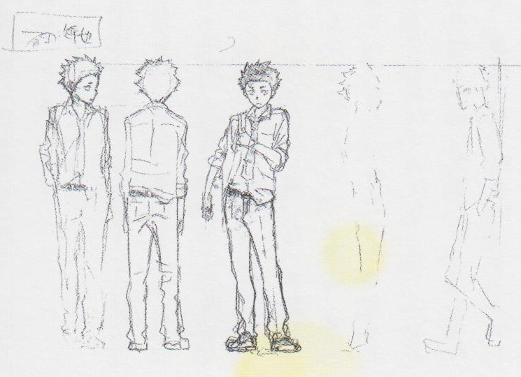
– So, how did you figure out how to draw a living Shouya then?
I got on the right track after talking with the director. The Shouya I drew at the beginning of the production felt somewhat unapproachable, so when the director commented he has the kind of charm that naturally draws people close to him I started adding aspects of gentleness to the design. Though some of the atmosphere that surrounded him when he was in elementary school remains, he now emanates a sense of frankness and kindness – he’s softhearted at his core. I wanted my drawings to exude that feeling and quickly build a sense of familiarity with the audience. Thankfully, there were many guidelines in the director’s storyboards; how he walks through corridors while guarding his body, or how his expression when he’s alone in his room simply spells out “this is Shouya”. Since the story itself deals with heavy topics like bullying and disability, I thought about respectfully balancing that so the film didn’t appear overly somber. In order to have the audience observe the characters without any added tension, I consciously made the designs soft and round. That way they would easily be able to immerse themselves in the world of the film.
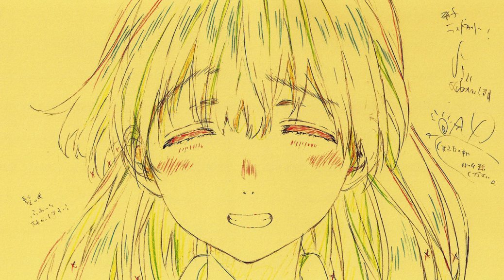
– How was designing Shouko?
It was important to keep her lovely, but that obviously wasn’t everything. I endeavored to both depict the feminine charm she holds inside and make it clear she’s not a frail person in need of protection, since she has the strength to convey her will to others. These are ideas integrated in the designs through details like how her mouth feels firmly closed or simply the thickness of her eyebrows. And to stray away from idealization, we also added aspects like how she has round hips but her waist isn’t narrowed.
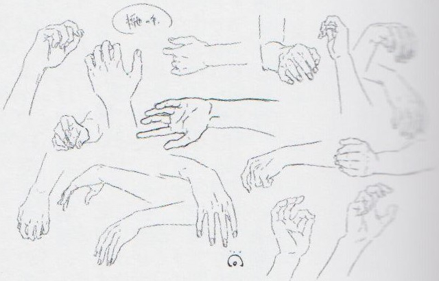
– Since sign language is a key element, you created a hand expression sheet on top of the usual facial expressions one. How did you decide how to draw hands in this film?
The expression wasn’t limited to just the scenes with sign language, the hands themselves always reflect the emotions of the characters. We could draw them plainly, but since they’re very particular parts that embodied a core theme of this production, I wanted to take special care to draw them charmingly.
– You sought to create realistic lines for this work. How did you take lines from real objects and place them into anime?
We took all parts and gradually simplified their lines and shapes, then measured the exact point where the animation would represent its real equivalent in the most effective way. For example, when faced with a drawing of clothes you shouldn’t obsess about all real wrinkles – you carefully select the lines that would effectively portray the feeling of the fabric, the parts that would make it look like stylish clothing, and so on. We thoroughly investigated the real shapes that we could use in anime.
– Please give us your impressions now that production has finished.
This is a movie built one cut at a time to allow you to experience the emotions that director Yamada poured into it. The staff worked as an actual team with a shared goal. I’m happy that everyone can experience this passion project.
Source: Koe no Katachi Making Book, which sadly isn’t officially available anymore.
Support us on Patreon for more analysis, translations, staff insight and industry news, and so that we can keep affording the increasing costs of this adventure. Thanks to everyone who’s allowed us to keep on expanding the site’s scope!
this was awesome thank you!! Futoshi Nishiya is such an amazing animator/designer
Rest In Peace