Anime Craft Weekly #26: Please Gohands and Never Come Back
It didn’t have to be this way. Not that long ago, GoHands’ name inspired hopeful excitement amongst animation fans, rather than a mix of hysterical laughter and sheer horror. There’s no getting around the fact that Hand Shakers is one of the most hideous pieces of entertainment ever conceived, let alone anime. But even something this abysmal can become an educational experience, so let’s learn a bit about a young studio and how anime is put together.
Those of you acquainted with the industry are likely already aware that anime studios are interconnected by an immensely dense net of relationships, and that new companies rarely ever sprout from nowhere; new studios are almost always the offspring of existing ones, born from causes as varied as personal relationships souring, financial issues or the simple desire of a subset of staff to chase new goals. Looking back to 2008, you might notice that Satelight suffered a bit of a rough time. After wrapping up Macross Frontier, part of their Studio 1 staff resigned and went on to form studio 8-bit. And on top of that, a huge chunk of their Osaka substudio as well as some members from their Studio 2 founded GoHands. A blow for them, but honestly an exciting time for fans as this new studio packed quite the animation punch. That’s something they immediately demonstrated, as their debut project Princess Lover! turned out to be way better produced than you’d expect from an average eroge adaptation at the time. It had some highlights like episode 9 handled by an amazing trio with Norio Matsumoto, Tomoyuki Niho and Kenichi Kutsuna, enabled by Satelight Osaka’s involvement in legendary animation-friendly projects like Noein. Koichi Kikuta, who is currently both enamoring and pissing off two opposed halves of the fandom with his charismatic and loose KonoSuba designs, drew all the layoutsLayouts (レイアウト): The drawings where animation is actually born; they expand the usually simple visual ideas from the storyboard into the actual skeleton of animation, detailing both the work of the key animator and the background artists. for a couple of episodes and did a lot of key animation for it, then went on to become a recurring studio collaborator.
Those are relationships that have decayed however, so it’s more important to look at the rest of the core staff that elevated the show. People like Shingo Suzuki, its Chief Animation DirectorChief Animation Director (総作画監督, Sou Sakuga Kantoku): Often an overall credit that tends to be in the hands of the character designer, though as of late messy projects with multiple Chief ADs have increased in number; moreso than the regular animation directors, their job is to ensure the characters look like they're supposed to. Consistency is their goal, which they will enforce as much as they want (and can). who has codirected most of GoHands’ projects as of late – including Hand Shakers. Other artists like Makoto Furuta who key animated the entirety of Princess Lover! #4 and later became one of the studio’s character designers and chief animation directors, a role he once again has been granted for Hand Shakers. And let’s not forget arguably its greatest asset Hiroshi Okubo; an exceptional animator who didn’t only earn the explicit credit of Main Animator in many GoHands shows afterwards – and yes, you guessed it, that includes Hand Shakers – but even turned his fondness of threedimensional camera movement into a studio staple. As you can see, the figures who stood out in their debut work have pretty much shaped the studio.
There were more influential creators involved with the company of course, like Mardock Scramble and K’s director Susumu Kudo and the designer Jun Nakai, but those are bonds that appear to have been cut in the last few years. And beyond individual names, what’s also extremely important to understand was the company’s attempt to build a brand. As I mentioned while talking about SHAFT’s history, it’s extremely important for studios to stand out; these companies require a constant influx of contracts to stay afloat, so having a reputation that makes producers think of them over the countless other candidates when planning a project is an invaluable asset. A few select studios like BONES, KyoAni and ufotable have earned their fame due to exceptional production strength, but for everyone else the solution has to be more quirky. It’s honestly amusing to compare the contrast between western anime fans who attempt to characterize all studios as monolithic entities and their often fruitless struggle to establish a personality. Having a studio culture is by all means positive as it allows the development of styles that might have died prematurely in the wild, it’s only when the brand crushes the individuals that problems arise. And in GoHands’ case, their studio image exploded right in their face in a rainbow CG debris filled spinning camera spectacle. From Mardock Scramble onwards, and with rare exceptions with origins that kinda predated it like Seitokai Yakuindomo, their whole output has been dominated by very aggressive postprocessing. What started with color filters and fake grain has ended up becoming an assortment of digital nightmares. And this has been happening under many different photographyPhotography (撮影, Satsuei): The marriage of elements produced by different departments into a finished picture, involving filtering to make it more harmonious. A name inherited from the past, when cameras were actually used during this process. and CG directors, proving the requests came from higher up – up until recently, the studio itself barely handled these tasks at all to begin with!
As a brief but important aside, I’d like to talk about anime’s composite to clarify some misconceptions. Most of the time, when you see fans bring up “filters and effects” it’s to complain that they exist at all. What they should understand however is that you can’t really have anime without them; simply placing animation over backgrounds makes them clash awkwardly, as they are two elements produced in entirely different ways by different departments. There’s a reason background animation cuts immediately stand out before they even move – our eyes detect that for once, the background and elements within it share a space. And to emulate that for regular scenes, some digital magic is required, which usually entails dealing with the lineart. Strong photographyPhotography (撮影, Satsuei): The marriage of elements produced by different departments into a finished picture, involving filtering to make it more harmonious. A name inherited from the past, when cameras were actually used during this process. departments also try to apply more effects, with the goals of not only enhancing the atmosphere but creating cohesion by doing things like bathing characters and surroundings by similar lights. And to be honest, that’s an approach older than most people who will be reading this! As I said in the guide to anime production credits, a bunch of composite terms – including PhotographyPhotography (撮影, Satsuei): The marriage of elements produced by different departments into a finished picture, involving filtering to make it more harmonious. A name inherited from the past, when cameras were actually used during this process. of course – predate any sort of current tools. If you’re a purist who will reject any show with apparent digital effects, I’m afraid to say that any oldschool-looking ‘clean’ new series has been thoroughly processed as well. And for everyone else: as usual, it’s a matter of execution and not simply presence/absence of elements.
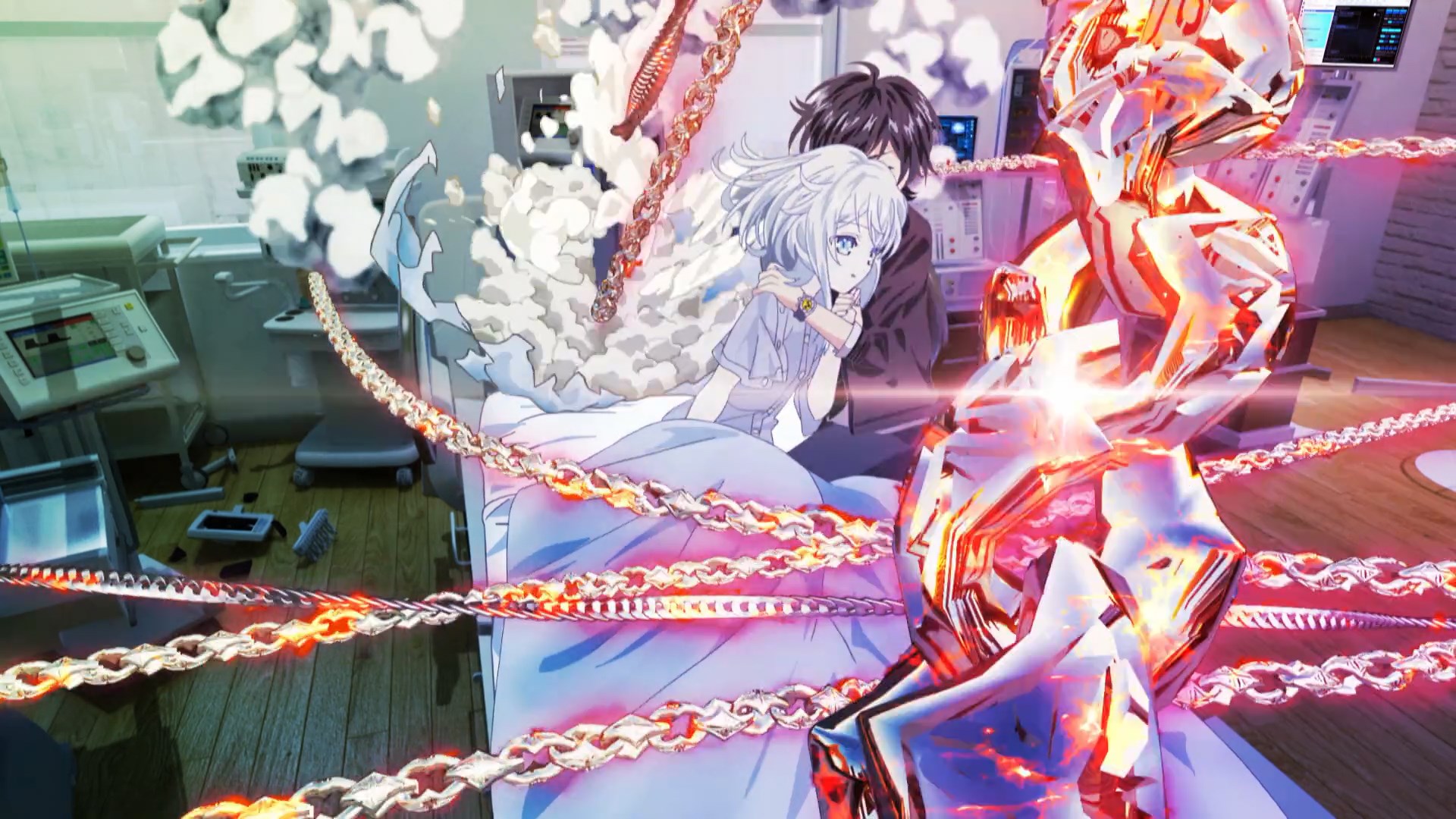
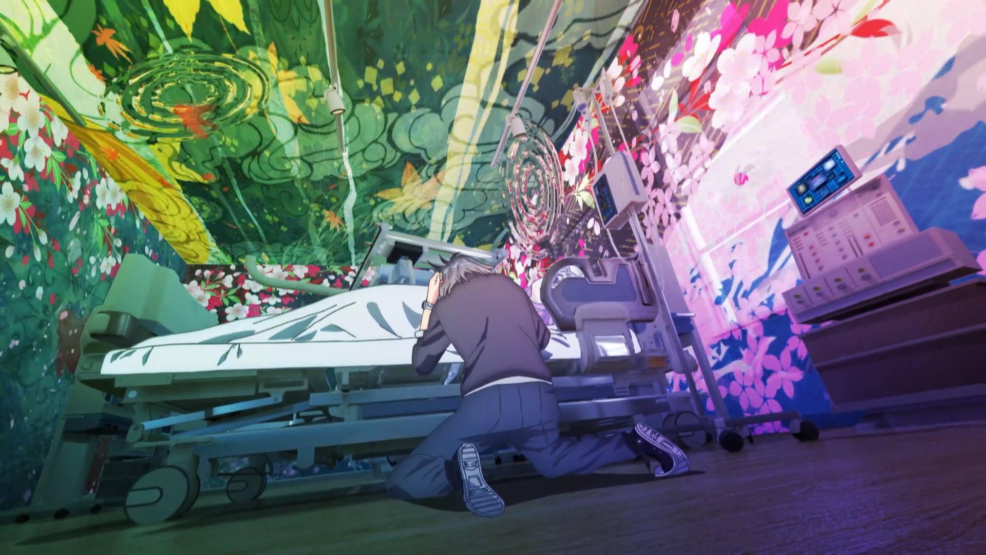
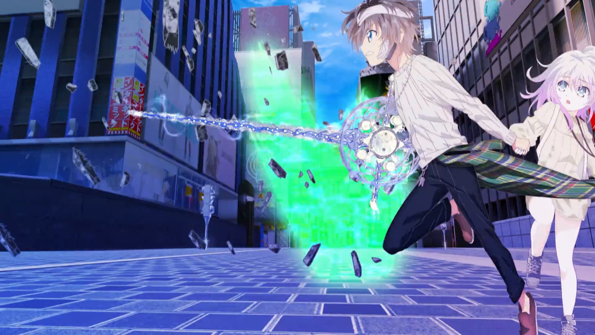
And with that out of the way, let’s tackle this monster. I wish it were as easy as saying that it’s just a matter of photographyPhotography (撮影, Satsuei): The marriage of elements produced by different departments into a finished picture, involving filtering to make it more harmonious. A name inherited from the past, when cameras were actually used during this process. gone wrong. That there’s solid craft hiding behind awkward layers of effects. That’s arguably how it used to be, but not anymore. Natural is the last adjective I want to attach to this abomination, but Hand Shakers is an understandable consequence of the studio’s escalation. A perversion of ideas that might have been perfectly valid in isolation, but that rot and melted together into toxic rainbow ooze. The dynamic camerawork that started with Okubo’s spectacular animation was enabled further via 3DCG, and the reliance on digital work only made them push harder towards strong postprocessing. It feels like at some point the methods replaced the goals – scenes no longer are meant to achieve a result, they’re showcases of this particular aesthetic the studio’s built. Take that to the extreme, remove any semblance of artistic sensibilities and you get… this. A garish mix of what appears to be 3 different series, all of which bad enough to individually be the worst looking anime of the year. Even the normal scenes fail entirely at creating the illusion that characters, and just about any element drawn by the animators, belong to the same plane of existence as the backgrounds. Things only get worse when magic powers kick in, arriving with even more discordant elements and flaming chains that looked like they escaped from Blingee. I was amused but not at all surprised when I saw that Hand Shakers, unlike basically any other anime, has no Color DesignerColor Designer (色彩設定/色彩設計, Shikisai Settei/Shikisai Sekkei): The person establishing the show's overall palette. Episodes have their own color coordinator (色指定, Iroshitei) in charge of supervising and supplying painters with the model sheets that particular outing requires, which they might even make themselves if they're tones that weren't already defined by the color designer. credited. Perhaps the first episode’s coordinator will handle the whole series, or perhaps the concept of color design has no place in this multichromatic nightmare.
The animation department doesn’t fare any better, despite having been the studio’s saving grace for quite a while. With misplaced enough priorities, no team of artists can produce decent work. The obsession with dynamic camerawork makes the production more taxing while barely leading to any exciting sequences, making action scenes headache-inducing and simple conversations just bizarre. The same could be said about the crowd movement cuts, which are very ambitious but only hurt the show; the animation directors clearly can’t keep up with the corrections, and they flat out had to reuse cuts from entirely different series. You don’t need any technical knowledge about the way scenes are constructed to realize the action falls apart in spectacular fashion as well. All the layouts are spatial nonsense, and the complete disconnect between all elements (which constantly move at different speeds) makes it all look floaty. Everything slides, and no interaction feels tactile at all, whether it’s hand drawn characters and backgrounds or 3DCG elements with the BGs. Anime isn’t bound by reality and has no obligation to obey to laws of physics. Subversion of the viewers’ expectations in these regards can even become a powerful tool. But this doesn’t toy with space in a deliberate way, it’s just an impossible to parse mess fueled by the idea of coolness of a teen overdosing on sugar. I’ve seen my fair share of ugly anime, and yet very few productions – if any at all – made me constantly wonder if they were truly real like this one.
At this point it should be obvious that we don’t like to focus on the negative on this site. Biting criticism can be fascinating, but there’s a deficit of appreciation of craft in the anime fandom so focusing on good stuff seems more appropriate. Something I saw on Twitter convinced me to give this article a go, however. Industry members are generally very polite towards their peers, and other companies are rarely ever mentioned with negative connotations even when there is personal beef. And yet, an important animator from a show I’m covering this season very naturally said they wanted Hiroshi Okubo’s animation away from GoHands. Something has gone wrong when you can’t even appreciate an exceptional artist’s work in isolation. So you know what – yes, he’s got a point. I wouldn’t mind seeing him leave. I wouldn’t mind seeing any of the talented individuals they’ve still got leave. As I said before, studios crumble and rise all the time. Maybe GoHands should just…go.
I hope this ended up being informative, even for the people who somehow can bring themselves to enjoy the studio’s output. I don’t want it to solely be a downer, and having people walk off with some extra knowledge and perhaps a smile would help justify having subjected myself to 24 minutes of that torture.
Support us on Patreon so that we can keep producing all this content and fullfill our next goals, as well as affording all server expenses. Thanks!
Make no mistake I thought this episode was a poor showing, but in my eyes that was largely driven by the dull, minimally-sensible story, and an almost entirely-undeveloped cast that I’ve little reason to care about. The ONLY thing that kept me watching were this episode’s visuals. Now I don’t think they were “good,” character acting when it was present was often so wild as to be difficult to interpret as conveying any coherent ideas or emotions, action was too wild and erratic to have particular weight or impact, and of course the worst offender of all was the incongruity… Read more »
As horrible as I thought /absolutely every scene/ looked, I can actually see that having a weird, fascinating effect. There really is nothing else even similar to this (thankfully!). Not the kind of unique I’d ever want, but unique nonetheless. And to be fair, it’s even *ambitious*. There are more complex, intricate cuts than in any episode this season so far. It’s a frankly amazing amount of misguided effort.
I’m finding myself in a similar situation. It was incredibly fascinating to watch this episode. And the ambition IS kind of impressive. It looks really bad, but it is so different and interesting that I will continue to watch. There is also certainly an element of so-bad-it’s-good with scenes like that conversation in the classroom with the water boobs. All in all, this is pretty entertaining for me. @Lachlan Still. You should check out some of their other work. I find most of it similarly interesting, though none of it achieves this level. (I have to see Princess Lover for… Read more »
I agree with Lachlan Still except there were some elements I actually liked, like I thought the chains were really bold and I’m going to watch every episode just for the visuals. I don’t want every anime to look like this but I appreciate that there is at least one and I actually hope for more. It kind of reminds me of some gallery artists I used to follow who pack their work with digital artificiality, and in that way I can also look at the story as kitsch.
Hah, I could’ve sworn I noticed something odd about the credits. That’s pretty funny. I’d say Hand Shakers is a lesson that the limits of 2d animation in general and TV anime in particular should be given a certain amount of respect, but then, Pokemon Sun & Moon is pushing techniques for greater freedom with camera movement too, only in a way which isn’t dumb and makes sense for the production. There’s a lot more to why Hand Shakers failed at this besides it being ambitious. Picking apart just what’s going on with this baffling mess is top quality entertainment,… Read more »
Perhaps the worst effect work like this have is making people wary of perfectly legitimate techniques. Dynamic camerawork trying to push boundaries is good, and so is thorough postprocessing. Crap like this poisons the well and makes people allergic to noticing any sort of digital effect.
And I’m glad you enjoy the general tone! Since we can afford to choose what to talk about, we generally lean towards projects that feature good work worth highlighting. This doesn’t mean avoiding the negative sides, but no point in consistently tackling garbage. Posts like this will always be a fun (?) exception.
I think the point (and I think what you’re trying to say) is that, it’s not about positivity or negativity. The fundamental difference between a nice/toxic environment is the intention. You can talk critically about all the bad parts of something, to educate about what’s not a good thing to do and how to improve(like what you did here). On the other hand, you can also praise something, just to express a disguise for something else. Constructive criticism is always welcomed, and I would be just as happy to see them as I would be to see constructive praise for… Read more »
Thanks for doing the article. While most that saw the episode could tell it was bad, I had wanted to see how the sakuga community saw it and what exactly went wrong and why. It has been very informative on that and how the studio came to this. I think the focus on positive exceptional performances is correct but this article was very helpful
Glad it was useful! I wanted to raise awareness of the people hiding behind the studio’s name too, so that it wasn’t all yelling at how bad the show looks.
I really liked some of the earlier GoHands stuff, even while other people didn’t. Mardock Scamble looked pretty good, regardless of the stupidly excessive filtering, and K Project had some genuinely cool sequences of CG backgrounds combined with solid character animation. But Hand Shakers… wow.. Hand Shakers is awful. It is so awful that I legitimately would never have guessed that a professional studio put it together. It’s actually comically bad, which is why I’ll continue to watch it for now. I don’t want to wish bad on the studio, but I have to agree, please give the talent at… Read more »
They have been bleeding some talent, and I wouldn’t be surprised if it kept on happening. Some animators don’t even like getting their drawings corrected too hard, let alone making them impossible to see below a million layers of garbage.
I think you forgot the word leave in the title… unless it’s a pun and I missed it. I was confused at first, until I got to the end of the article though. I’m glad you wrote this. I got a good laugh at the screenshot, but ultimately it’s sad to see this kind of thing happen. Now I’ll just run back to Little Witch Academia.
I’m not sure how to put this, but how does something like Kizu work? It also combined CG backgrounds and 2D characters, who stood out a little bit, but it always looked great and most of the moments looked in harmony. It never felt so jarring and, well, revolting like Hand Shakers. But even when it looked awful, I kind of liked how Hand Shakers wanted to give some life to the background characters during the school scene, and the 3D camera work, although rather pointless, wasn’t that bad when MC-kun was talking with Miss Bouncy Boobs. But then they… Read more »
I think Kizu is in the exact opposite end of the spectrum – the stark contrast between the characters and the world is an asset, and the idea that they don’t quite belong in there is thematically coherent. Which is something Hand Shakers could have aimed at, but… yeah, no. And if you divorce everything from its context, Oishi has an exquisite aesthetic sense and a penchant for combining different artforms within his anime, so as far as I’m concerned he simply makes it look better. But yeah, I think it’s important to keep in mind visual cohesion isn’t a… Read more »
I was wondering the same thing as chito, and I guess it really does boil to down a matter of execution. From rewatching the first Kizu sequence, I noticed that Araragi’s color palette meshes well with the environment’s, and the lighting on his body matches the environmental lighting (even changing as he walks past different light sources). So maybe it works because of these subtle harmonious elements?
Anyway, thanks for the article – was really hoping to find something on the “craft” of Hand Shakers after seeing the premiere and I’m glad you chose to write about it.
Apart from what kViN said, another reason Kizu looks well even with the very different styles is because they do a good job filtering the outlines in the post-processing phase. This allows the animated elements to mesh well with the background instead of looking like two separate elements. Every anime does this, some more successfully than others, but we tend to only notice the ones that *don’t* do it well. If you zoom in on any screencap of Kizu (or any other well-filtered anime, for that matter), you should notice the outlines look a bit blurred / “mixed” in with… Read more »
I would really like to see an in-depth post about photography/compositing in anime that goes into the technical details. It often gets passing references, but I have never seen the actual techniques discussed.
I’ll try to tackle that someday, but the reason there aren’t many in-depth looks at that is that WIP photography materials are rarely ever shared (just compare to how prominent genga is instead). In the first half of this video you can see Yamada visiting the digital department and some effects being applied https://www.youtube.com/watch?v=-WCLHP3CRRo
Thank you, kViN. I hope you can find the time/motivation to do it. It would be extremely educational.
I don’t really want to see GoHands go really. the first episode was really bad visually but I thought a couple of areas were pretty solid imo. I, being a detail loving freak, love the over detailed designs and some of the animation for characters even with all that detail is pretty impressive. in saying that…. some of it…. a bit…. but I believe that they’ll improve on it in further projects. at least, I hope. they have amazing potential…. but it looks like they aren’t using it at alll by this apart from a few animators. in saying that….… Read more »
GoHands was formed over a talent schism, so if another one happened the artists themselves would be fine. That said, I don’t think it will… at least not en masse. But they might keep on losing strong animators who aren’t pleased with their work being sort of impossible to appreciate.
yeah I was pretty disappointed considering the best animated episode of the second season of K got into top 10 tv rankings that week. that had to show them how important good production is…. sadly…. looks like it didn’t. tbh the only reason I am gonna continue watching is I love character animation of super detailed designs. even if it’s only a minute or so I’d love to see it. Let’s hope at least the next series is an improvement over this
I thought Break and Binds chain attacks and running scenes whenever they did the front view to the side view as he ran looked really cool…as well as giving life by having background crowds and characters doing actually really intriguing stuff, felt different than most other anime. Was it really that bad to reuse that K scene, also I was sure they reused a bit more from K especially in the opening scene through the city buildings? No one ever complains when anime reuses same sound effects. I much love this hand shakers and K versus their really thick lines… Read more »